by Lala Ragimov
This is my quick translation of excerpts of Jombert's Methode pour apprendre le dessein , 1755. If you see mistakes or have comments, please write below or send me a message.
The book is a compilation of extremely detailed drawing advice by different authors (I could recognise Goeree, de Piles, de Lairesse and Bosse, maybe there are others as well).
It contains illustrations by/after Cochin, Audran, Le Brun, etc. An earlier edition has a completely different set of illustrations, some by Abraham Bosse (download here)

p62
Of different ways to shade a drawing.
(borrowed from Goeree - L.R.)
Up to now we have spoken about the outline or contour, now we will explain about shading.
Shading can be done in three ways:
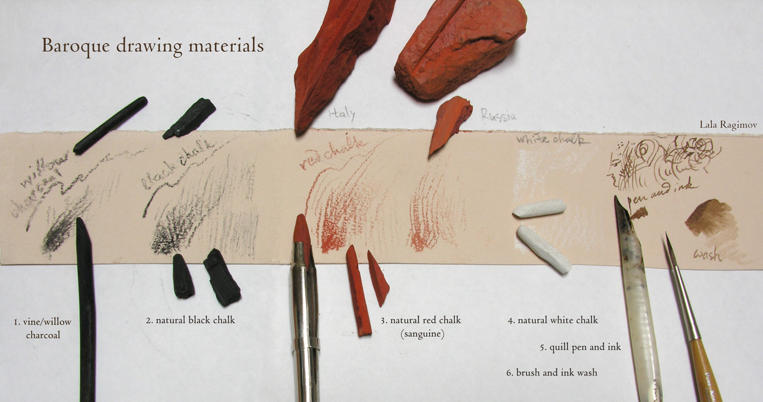
-hatching (en hachant) simply with the chalk, like in prints; that which is bad taste and is almost not practiced except for those who are learning how to engrave;
- graining (en grainant) rubbing the crayon on the paper to prepare the masses of shadows and then hatching on top to form them and stop them: this manner is called "grainer" because this rubbing makes the grain of the paper appear.
- stomping (en estompant) that which is done melting the lights with the darks by the means of a rolled piece of paper with the tip with which one lightly rubs the drawing after it is shaded with the crayon:
p63
this rolled paper is called an estompe. It could be done with chamois leather rolled that way, or one can even take powder of sanguine or other chalk with the tip of the estompe and make the tints for shading as one does with a brush: then one retouches it stronger with a chalk.

Way of shading by hatching with a chalk.
The manner of shading by hatching is done with lines or hatch-marks which one redoubles ones on top of others in different directions until one gives the necessary force to the shadow, taking care not to cross them too much which makes the drawing hard and bad taste.
That is why one should avoid crossing the lines at right angles but rather to put the second layer diagonally which creates spaces between lines that that look like lozenges (not squares).
I will not enter into more detail here, on the manner to arrange the hatch-marks see le Traité de la Gravure à l'eau forte et au burin of which a new edition came out some years ago.
One needs to be able to hatch in all directions without having to turn the paper every time, and always with a thick crayon, even for the delicate hatch-marks which one puts in the lights, supposing always that one is drawing big, which is necessary if one wants to make progress in this art. Thus one needs to get used
p64
to a thick chalk and to sharpen it as little as possible. There are even masters who don't permit their students to sharpen their chalks except one time. This method is good and not that difficult because as the chalk thickens and its point blunts, it forms angles with which one may mark the most delicate lines.
When one hatches all the shadows with chalk on white paper, it is necessary to take care of the paper that serves for the lights, especially when you use sanguine because it cannot be completely erased with the bread, and it always leaves spots on the paper. Black chalk dirties the paper less and is less greasy than sanguine.
Manner of drawing by graining.
After having finished your sketch by going over the traces of the first outline with chalk, you "grain" with a lot of force and prepare the drawing throughout: but before shading it completely make sure that your outline is exactly like the original.
Because you want to draw in good taste don't arrange big lines (tailles) and beautiful hatching slavishly except where necessary, because if the drawing is only grained it will seem drawn too softly, obliging you to hatch certain places
p65
to make half-shadows and to stop the shadows with more firmness: but you need to do that without affectation and that the resulting mix is a fat and soft (velvety) (moelleux) paste. To draw in a "fatter" manner you put the darkest touches into the thickness of the shadow sufficient to prevent the traits to cut too hard with what is near it and that they hit the main force in the middle.
You should avoid making areas of shadow too thin and too parallel. Notice also that the nature is never perfectly round, but that one finds it composed of many angles and planes (méplats), but that one shouldn't overemphasize making the contours angular similar to rocks. This defect would be even worse than drawing too round: one should find the right mean between these two ways of drawing.
A note by Jombert: Planes is a term peculiar to painting. The human body is not all round but is composed of surfaces that are flat and rounded only at the edges, one needs to make those different surfaces felt in the drawing. Une manìere meplatte is that which makes the planes felt, une manìere ronde is the one that ignores nature. (borrowed from Goeree - L.R.)
A way to shade by stomping
Sweetening (blending) what one has hatched before by rubbing with an estompe. If the paper is white, all the half-shadows are done
p 66
by the estompe alone, rubbing lightly because it's charged enough with the colour. And one should reserve (menager) the white of the paper for the lights.
Sanguine is stomped like black chalk on white or grey paper, but stomped sanguine is not as pleasant-looking as black chalk. If the paper is grey it's heightened with chalk white; but you cannot stomp it. Finally one gives force to the greatest shadows by hatching on top, but with little or no stomping.|...|
p67
|...| There are people who give force to their sanguine drawings by retouching them with a bit of black chalk, especially when they don't have dark sanguine: others make flesh-tones with red chalk and the draperies with black chalk to make their drawings more pleasant-looking by the variety of colour.

About pen drawings
It seems that the pen suits people who draw well more than to beginners,
p74
because once put down it can't be erased. There are nonetheless those who believe that it's good for beginners to make them pay more attention, but few people think this way because the habit of the pen leads to a hard and dry style of drawing. For learning it nothing is better than copying good prints where the burin is beautiful and where there is no confusion about hatch-marks, such as prints of Carraccis, Melan and Le Clerc. This manner of drawing is the best for those who want to practice engraving.
For drawing with a pen plumes of the crow or goose are usually taken, because they are harder and make a neater lin on paper. The best are the tips of wings, those of right wing, those where the side of the longest barbs looks at the thumb are the best in the hand for drawing or writing. One should always chose the lightest and thinnest ones: lightest because they cut (split) easier, and thinnest because they will be easiest to cut for thin lines. The oldest are the best as long as they stayed in a dry place. Crow quills are the best for
p75
drawing the landscape. Swan quills are only good for thick lines. Drawings done entirely with ink are only used for architecture.
p122
Flowers and plants should be shaded with delicate and careful hatch-marks in the direction of the growth of their leaves
© Lala Ragimov - when citing my translation, please make sure to write my name next to the quote
This is my quick translation of excerpts of Jombert's Methode pour apprendre le dessein , 1755. If you see mistakes or have comments, please write below or send me a message.
The book is a compilation of extremely detailed drawing advice by different authors (I could recognise Goeree, de Piles, de Lairesse and Bosse, maybe there are others as well).
It contains illustrations by/after Cochin, Audran, Le Brun, etc. An earlier edition has a completely different set of illustrations, some by Abraham Bosse (download here)

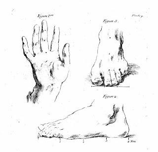
Charles-Nicholas Cochin's illustration in Jombert
p62
Of different ways to shade a drawing.
(borrowed from Goeree - L.R.)
Up to now we have spoken about the outline or contour, now we will explain about shading.
Shading can be done in three ways:
-hatching (en hachant) simply with the chalk, like in prints; that which is bad taste and is almost not practiced except for those who are learning how to engrave;
- graining (en grainant) rubbing the crayon on the paper to prepare the masses of shadows and then hatching on top to form them and stop them: this manner is called "grainer" because this rubbing makes the grain of the paper appear.
- stomping (en estompant) that which is done melting the lights with the darks by the means of a rolled piece of paper with the tip with which one lightly rubs the drawing after it is shaded with the crayon:
p63
this rolled paper is called an estompe. It could be done with chamois leather rolled that way, or one can even take powder of sanguine or other chalk with the tip of the estompe and make the tints for shading as one does with a brush: then one retouches it stronger with a chalk.

Polenich after Charles Le Brun
(illustration used by Jombert)
Way of shading by hatching with a chalk.
The manner of shading by hatching is done with lines or hatch-marks which one redoubles ones on top of others in different directions until one gives the necessary force to the shadow, taking care not to cross them too much which makes the drawing hard and bad taste.
That is why one should avoid crossing the lines at right angles but rather to put the second layer diagonally which creates spaces between lines that that look like lozenges (not squares).
I will not enter into more detail here, on the manner to arrange the hatch-marks see le Traité de la Gravure à l'eau forte et au burin of which a new edition came out some years ago.
One needs to be able to hatch in all directions without having to turn the paper every time, and always with a thick crayon, even for the delicate hatch-marks which one puts in the lights, supposing always that one is drawing big, which is necessary if one wants to make progress in this art. Thus one needs to get used
p64
to a thick chalk and to sharpen it as little as possible. There are even masters who don't permit their students to sharpen their chalks except one time. This method is good and not that difficult because as the chalk thickens and its point blunts, it forms angles with which one may mark the most delicate lines.
When one hatches all the shadows with chalk on white paper, it is necessary to take care of the paper that serves for the lights, especially when you use sanguine because it cannot be completely erased with the bread, and it always leaves spots on the paper. Black chalk dirties the paper less and is less greasy than sanguine.
Manner of drawing by graining.
After having finished your sketch by going over the traces of the first outline with chalk, you "grain" with a lot of force and prepare the drawing throughout: but before shading it completely make sure that your outline is exactly like the original.
Because you want to draw in good taste don't arrange big lines (tailles) and beautiful hatching slavishly except where necessary, because if the drawing is only grained it will seem drawn too softly, obliging you to hatch certain places
p65
to make half-shadows and to stop the shadows with more firmness: but you need to do that without affectation and that the resulting mix is a fat and soft (velvety) (moelleux) paste. To draw in a "fatter" manner you put the darkest touches into the thickness of the shadow sufficient to prevent the traits to cut too hard with what is near it and that they hit the main force in the middle.
You should avoid making areas of shadow too thin and too parallel. Notice also that the nature is never perfectly round, but that one finds it composed of many angles and planes (méplats), but that one shouldn't overemphasize making the contours angular similar to rocks. This defect would be even worse than drawing too round: one should find the right mean between these two ways of drawing.
A note by Jombert: Planes is a term peculiar to painting. The human body is not all round but is composed of surfaces that are flat and rounded only at the edges, one needs to make those different surfaces felt in the drawing. Une manìere meplatte is that which makes the planes felt, une manìere ronde is the one that ignores nature. (borrowed from Goeree - L.R.)
A way to shade by stomping
Sweetening (blending) what one has hatched before by rubbing with an estompe. If the paper is white, all the half-shadows are done
p 66
by the estompe alone, rubbing lightly because it's charged enough with the colour. And one should reserve (menager) the white of the paper for the lights.
Sanguine is stomped like black chalk on white or grey paper, but stomped sanguine is not as pleasant-looking as black chalk. If the paper is grey it's heightened with chalk white; but you cannot stomp it. Finally one gives force to the greatest shadows by hatching on top, but with little or no stomping.|...|
p67
|...| There are people who give force to their sanguine drawings by retouching them with a bit of black chalk, especially when they don't have dark sanguine: others make flesh-tones with red chalk and the draperies with black chalk to make their drawings more pleasant-looking by the variety of colour.

Gérard Audran (reused by Jombert)
About pen drawings
It seems that the pen suits people who draw well more than to beginners,
p74
because once put down it can't be erased. There are nonetheless those who believe that it's good for beginners to make them pay more attention, but few people think this way because the habit of the pen leads to a hard and dry style of drawing. For learning it nothing is better than copying good prints where the burin is beautiful and where there is no confusion about hatch-marks, such as prints of Carraccis, Melan and Le Clerc. This manner of drawing is the best for those who want to practice engraving.
For drawing with a pen plumes of the crow or goose are usually taken, because they are harder and make a neater lin on paper. The best are the tips of wings, those of right wing, those where the side of the longest barbs looks at the thumb are the best in the hand for drawing or writing. One should always chose the lightest and thinnest ones: lightest because they cut (split) easier, and thinnest because they will be easiest to cut for thin lines. The oldest are the best as long as they stayed in a dry place. Crow quills are the best for
p75
drawing the landscape. Swan quills are only good for thick lines. Drawings done entirely with ink are only used for architecture.
p122
Flowers and plants should be shaded with delicate and careful hatch-marks in the direction of the growth of their leaves

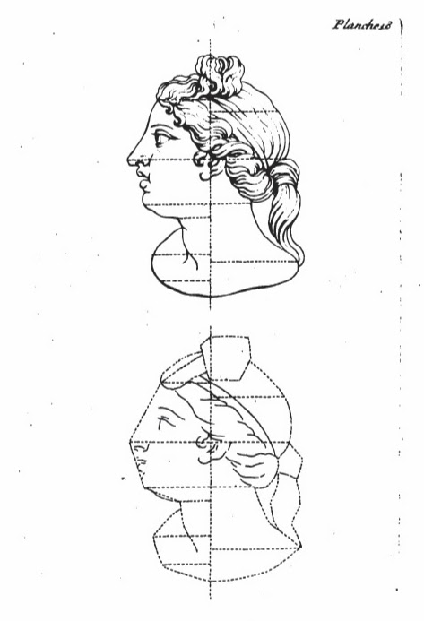
Cochin (?), illustration, Jombert
My related posts:
English translations of drawing treatises (Goeree, de Piles, Jombert)
My related posts:
English translations of drawing treatises (Goeree, de Piles, Jombert)
1400s-1700s drawing
treatises online
Painting materials of Rubens, with bibliography
Renaissance woodcut tools
Image gallery: my copies and reconstructions
Painting materials of Rubens, with bibliography
Renaissance woodcut tools
Image gallery: my copies and reconstructions
Inspired
by Rubens (Getty Museum page, featuring me)
Copying a Rubens drawing (materials, techniques)
Copying a Rubens painting (materials, techniques)
Copying a Rubens drawing (materials, techniques)
Copying a Rubens painting (materials, techniques)
© Lala Ragimov - when citing my translation, please make sure to write my name next to the quote


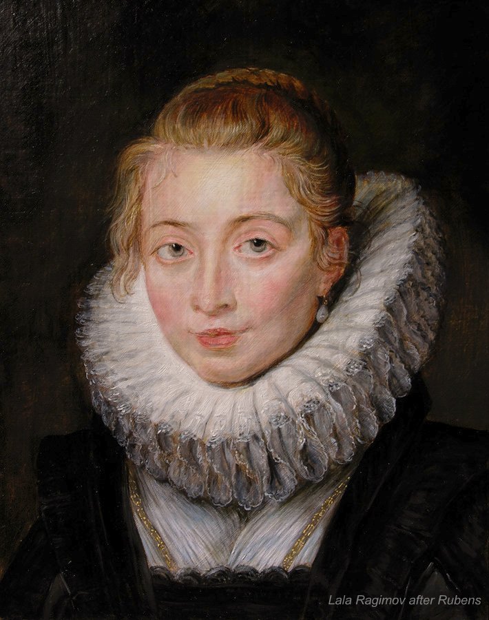
 \"Infanta's Waiting-maid in Brussels\", 1623-25. The Hermitage")


