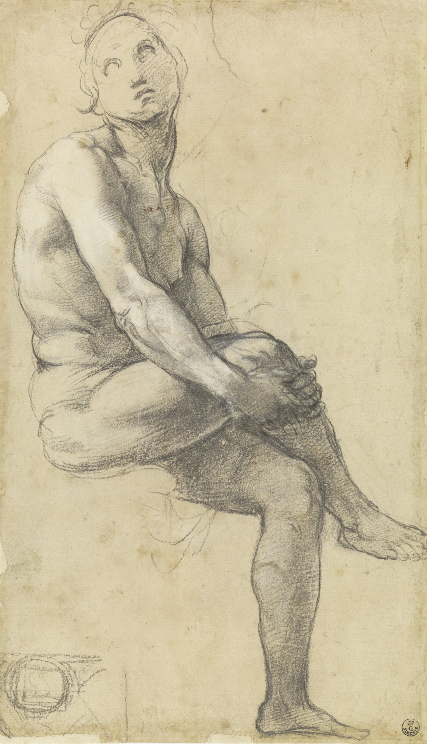
Showing posts with label baroque. Show all posts

Monday, 28 April 2014

"An Introduction to the General Art of Drawing" by Willem Goeree. Full text.


In 1668 Willem Goeree (1635-1711) published an influential treatise on drawing, Inleydinge tot de Al Ghemeene Teycken-Konst.  In comparison to the treatise of Leonardo which it borrows from, it contains an unusually large amount of technical information about drawing materials and techniques.  It also deals with interesting practical matters of learning and teaching drawing, that other treatises don't touch upon.  The book in Dutch was republished and reworked several times and translated to German and English in the 1600s and later. I also find bits and pieces of its text used in numerous other drawing manuals and treatises (e.g. Salmon, de Piles, Jombert) without a mention of Goeree's authorship.

I have transcribed and posted the 1674 English translation keeping the original spelling.  There are three illustrations in the text.  I substituted them with corresponding plates from editions of Goeree publicly available on-line.  

This English translation also contains many plates at the end that I haven't included because of their copyright status.  These plates don't appear in Goeree books in Dutch or German. They represent the traditional drawing book repertoire: eyes, noses, mouths, hands, feet, faces, and whole figures, most of them rather unrefined copies of well-known drawing book prints (I could recognise Fialetti, Palma il Giovane, Reni, Cousin, maybe Bloemaert and Guercino; others I have not yet identified). 

I've done this project on my own and without feedback, so I will appreciate any comments, corrections, suggestions and any other input.   I would also be happy with a greeting from anyone who studies this subject.


Illustration from a 1678 German edition (digitized here)
________________________________________________________

AN INTRODUCTION TO THE GENERAL ART OF DRAWING 
(for full name see title page)


CHAPTER I
What the Art of Drawing is, and in what it doth consist 

list of side notes:
Wherein the Art of Drawing doth consist. 
The Art of Drawing necessary to all men.
Principally to Picture-drawers.
The Art of Drawing is the soul  of the art of Painting. 
The Art of Drawing needeth the whole man
The Art of Drawing ought to have his Fundamental Rules as well as other Arts.
In the instruction you must go from step to step
A Simile or Similitude.
You must begin for the first step and go not the second before you well understand the first.
The Art of Drawing, beloved of all men.
The first Mover in this desire which comes of a natural inclination
Parents ought to observe the natural inclination of their children.
How you may know whether a child be born to the Art of Drawing or not.
Drawers and Picture Drawers must be of a singular nature.
Similitude.
What a young Learner must do.
How instruction is given.

Observation of this introduction
The Learner must apply himself to a good Master
Wherefore?


CHAPTER II

The first Beginning of the Art of Drawing.
 

The first exercise.
Perspective.
The first beginnings are about some particular Members.
Faces subject to most changes.
Oval.

What the Oval doth signifie.
Reason wherefore this Cross in the Oval is not understood of the young Learner.
A great fault.

Means to understand to draw with judgment all manner of faces.
A Fore-right face.
a 3/4 face
A face looking downward
A face looking upward.
A side face 
The profit that comes by the manner of this instruction.
Good Masters not always good Teachers


CHAPTER III
Of the Order and Manner to be Observed in the Art of Drawing.
 

First step. To draw after Draughts very profitable
Second step.  To draw after Pictures. Requires greater judgement. For what reason

The third Step.
A good Figure necessary to draw after.
The reason

The fourth Step
Perswasion to much drawing.
Example to others.
Custom in Rome
This should invite us to imitation.

CHAPTER IV
Of those things which in every degree of the Art of Drawing are necessary to be observed.
 

Drawing after Draughts.
Drawing after a Picture.
How to place a picture.
Distance.
Put your Principal right before you

The beginning of a Draught.
You must assure your self of every stroke.

With patience your must overcome your passions.
The Actions must appear as first in your scetzing.

To use care, thus in drawing a Schetz neater, that you lost not the action. 
Confer your draught with your principal.
Faulss (as soon as seen) to correct.
Better is one good Draught, then 100 without observation
You must sometimes behold your work with a fresh eye.
How it comes to pass that we better discern faults. 
Reason wherefore
Example


CHAPTER V 

Of the things which in the third Step, viz. in Drawing after Plaister-Rounds, or Embossed Works, are necessary to be observed.

To chuse a good light to draw after Plaister-Rounds.
Means how to amend the light.
At what height you shall chuse your light.
Night-light.
How to use the same.
Night-light giveth hard shades.
Remedy

What distance to use in sitting.
To observe how the parties the one under the other do appear.


CHAPTER VI

Of the anatomie, or Knowledge of the inward and outward forme of the Humane body, concerning Muscles and Motions of the Arteries.
 

To know Anatomy necessary.
Profitable.
Abuse.
Means to exercise themselves herein.
Anatomy in Plaister
Divers Books of Anatomy.
From the Books go to the life.
Not to make all Muscles.
Wherefore.
In what part you must observe your Muscles most.
Wherefore
Fat bodies have small Muscles.
Fair bodies must not be muscled hard.
Wherefore.

Of Muscles, many changes.
In what parts the most changes are incident.


CHAPTER VII
Of those things, which in drawing after the life, are necessarie to be observed and understood.
 

The natural Life reacheth all things.
To chuse a College
To what purpose
Place, light.
Model of what shape.
Place, light.
Divers manners to set the Model in action.
In all actions Members must make a Compact together. 
What Principally is to be observed in the good actions.
Examples of four footed beasts.
The good Position Of a figure.
Out of the tending of the Members to see what doth the figure.
The manner how to sit to draw. You shall not look too much, or imitate anothers Draught. 
Unskilful Drawers may place themselves with them that are experienced
For what reason. 
What is to be observed commonly. 
The Model shall not stand too long in his action.
Wherefore
Observation
To learn to draw compleatly
To draw Landskips


CHAPTER VIII

Of the several sorts of Chalks and Crions for the Use of Drawing, and upon what they are to be used.
 

Charcoal.
Black lead good for to scetch withal, principally for Masters, that are sure in their drawing.
Red chalk.
Black chalk.
Faults
Use.
Charcoal dipt in Linseed-oyl.
One or two houres.
Tobaccho---Pipe-clay.
White Chalk
Coloured Crions how to make them
Whereupon to draw

White Paper.
Coloured paper.


CHAPTER IX
Of the Use and Manner of Drawing.
 

Learners are counselled to follow their Principal
Manner how to do.
How to hold your drawing Pen.
Rouseling
Rouseling alone not very graceful.
Hatching and doseling a good manner.
Doesling.
Common mishap.
Remedie.
Manner how to smooth som heightenings.
Washing.

Use.

CHAPTER X

Of the General and his Parts, and how they must be understood and observed.
 

What Parts and Generals are.
Use
How to see them.
For what reason.
Example
Distinction.
Parts also have a generality in themselvs, altho' they are Part to the general.
Example.
Likeness of things dwelleth most in the general.
Example.
2 Example.

Contrapositio.

CHAPTER XI
What light and shadows be, and how thorow the same all things come to have their being.
 

Lights and shades can express all things.
Lights and Shades can express all things.
Prove.
General shadow.
Shadows upon shadows.


CHAPTER XII
Of the Plain, smooth, sharp, and sweet drawing.
 

Learners abhorre plain drawing.

CHAPTER XIII

Of the Heightenings.

CHAPTER XIV
Of the Reflection.
 

Reflections wheron they fall most.
Reflection by what occasioned.

Use not too much of reflection.
Wherefore.
Not to make reflection without cause.


CHAPTER XV
Of the Observation of Perspective of light and dark.
 

Necessitie of observation.
Similitude.
What you shuld take heed of in your observation
Dark comes forward as well as light.


CHAPTER XVI (one illustration)

Of the Circumferent or out-stroke, and his looseness and a good Position, as also of keeping of their Parts.
 

Scetch.
Circumferent stroak.

Strokes on the side of the light to make sweet.
Draughts must be drawn without circumferent strokes,
The life is without strokes.
Example
Strokes you must not draw till necessitated.
Small things are drawn without strokes, and appear as if they were.


CHAPTER XVII
Of the Finishing of a Draught.
 

Profit of this observation.
Heightenings never to make so high as the highest wont.
Observation
In Pictures dark and light difficult to distinguish.
Wherefore.


***
An Addition


PLATES (see my introduction above)


Sunday, 27 April 2014

Goeree, Chapter VIII

transcribed by Lala Ragimov, original spelling kept

An introduction to the general art of drawing

A 1674 English translation of
a drawing treatise by Willem Goeree (1635-1711)

 <<Previous Chapter            Table of Contents            Next Chapter>>

_______________________________________________


CHAP. VIII.
Of the several sorts of Chalks and Crions for the Use of Drawing, and upon what they are to be used.
Charcoal.
Black lead good for to scetch withal, principally for Masters, that are sure in their drawing.
Red chalk.
Black chalk.
Faults
IT is commonly customary, that Beginners begin first to draw with Charcoal, being very commodious, not only to young Practitioners, but even to good masters themselves, which in drawing are very perfect and experienced by reason that whatsoever is drawn therewith, and is not according to our minde and purpose, may easily be wip't out, and drawn over again. Practitioners use also black lead, therewith to scitch their Figures, and work the same out afterward with Crion, and other things usual to drawing; nevertheless, this is more fit for Masters then Practitioners, and therefore more necessary to get first the use of Charcoal well, before they attempt the use of black chalk. The other sort wherewith you must perfect your draughts are several, and every one makes choice of that which pleases him most. Some use red chalk, and in like manner black chalk is very commodious; but it is difficult to get that which is good, commonly it has two faults, which are tedious to Practitioners; the one fault is, that it is short, weak and brittle; the other that it is hard and stonie; yea, that which is somthing good comes often to be so hard; thorough the heat of the hand, that it becomes useless, some put it in a cellar, others lay it in the ground with salt, that it might remain soft; in buying buy that which has some yellow spots upon it like brimstone, and which doth taste saltish and sourtish, and is smooth in cutting. Others draw with the Pencil, which is called washing and is done with several saps, viz. Ink, Sut of wood-smoke, Ground-Indico, East-India Ink, Ground red chalk, and such like, which are all good in washing of Draughts, especially for them that know how to use them. 
Others draw with wet Chalk Pencils for sureties sake, others with writing Pens, which I do not so well approve of, except it be that such who draw with a writing-Pen have an intention to become Engravers upon Copper; but for them that desire to become painters or Picture-drawers, I count it time idle spent; And although the same has bin in use with a great many great Masters, you shall know that such Masters did use the same for to represent their Figures readily and boldly, and with great and bold scetchings, using also in stead of the writing-Pen, a Pen made out of a Reed, such as here with us we use to cover houses withal. This Reed-Pen is also useful to draw Landskips withal, and has a singular loosness, especially for them that knows how to use them Master-like, with good dexterity; -- 

Use.
commonly they use them with sut and water, and also with common Ink, or East-India Ink, as is to be noted in draughts of old Masters, of Bandio Baccianello, Titian, and others of that time. --- 

Charcoal dipt in Linseed-oyl.
One or two houres.
Beside all these, some use also the Charcoal dipt in Linseed-oyl, but must be used quickly and readily, and therefore fit for great things, but for small and curious things unfit and unprofitable; And these charcoal Pencils most commonly are laid one houre or two in Linseed-oyl (before they use them,) and after they are taken out of the oyl they must be well wip't, and so use them presently; note also, that they must be somthing long, for they wear away presently, and become quickly useless. 

Tobaccho---Pipe-clay.
White Chalk.
Coloured Crions
how to make them.
They use also a second sort in drawing for to heighten withal, if they draw upon coloured Paper; and this is made of Tobaccho-pipe clay, which being soft is rolled to the length of a finger; and being dried, either of themselves, or in the Sun, are fit for use; and for stronger heightning you may use white Chalk, and it is necessary to give here and there a stronger heightning; You also may use this Tobaccho-pipe-clay, to make all sorts of Crions of it. Thus take tobaccho-pipe-clay, and with a little water temper in the same what colour you please, according to the height you think fit, and as much as you think the clay may bear, and work it well together, and make Pastils of it, and let them dry as aforesaid, then they will be fit for to shew here and there the colours, either in scetches, draughts, or whole Ordinances; Others do this with old size, gums, and such like; but those often prove too hard and not useful: and this may serve as concerning the diversities, wherewithal the Practitioner may exercise himself with in his drawings, without prescribing any more otherwise, for making or using of stuffs to draw withal. 

Whereupon to draw.

White Paper.
Coloured paper.
Now only I will say something whereupon to draw with those several sorts above specified, and conclude this chapter. To draw upon white paper is the most usual, commodious, and common way or manner; though some use Parchment, Table-books, and other things; but we will remain by the white paper; upon white paper you may scetch, wash, and draw with all sorts of water-colour; you may dozel upon the same dry colours with a little cotton upon a quill; but in regard to the white Crion cannot be used upon white paper, therefore papers of several colours are made, as gray paper, yellow, red, rose-coloured paper, blew paper, or what they may please your fancie best: these several colours, and other- what pleases you best, you may grind with water, adding thereunto a little size, and with a sponge dipt in it, give the white paper what colour you please, and being dry draw upon it, and upon this coloured paper the white Pastils have great power in drawing, especially to them that know how with judgement to apply them; of which hereafter we intend to instruct you further.


<<Previous Chapter            Table of Contents            Next Chapter>>

Goeree, Chapters XI, XII, XIII, XIV

transcribed by Lala Ragimov, original spelling kept


An introduction to the general art of drawing


A 1674 English translation of
a drawing treatise by Willem Goeree (1635-1711)


 <<Previous Chapter            Table of Contents            Next Chapter>>


___________________________________________________


CHAP. XI.
What light and shadows be, and how thorow the same all things come to have their being.
IT would be in vain to make a further progress in our Instruction, unless we understand first the nature and virtue of lights and shades, for there are no things in nature which can be distinguisht by us in a lesser or a further distance from us, much less can be expressed by the Art of drawing without this knowledge, for without dark and light nothing can be made like, or to resemble unto, or after that, which it ought to resemble, so that by consequence the lights and shades gives a being and representation unto all things; and to prove this, draw a counterfeit upon white paper with black Chalk, laying aside all sorts of Colours or Crions, then you and others shall judge that the Counterfeit is well drawn, and the likeness good. (I speak of one that is fit and well-experienced in such things.)--- Here is asked, what correspondence hath black chalk wherewith you made your shades, and the white paper, thorow which is represented the light of your counterfeit, which have lively colours, and being of that same, after whom you took your draught, that such a lively picture so like should be made; this likeness is not caused thorow the circumference or out-stroke; it is not the black chalk, nor the white paper, neither any single strokes drawn; 


Lights and shades can express all things.
Prove.
but it is only the lights and shades properly set in their places, with such a just and equal ballance as can be imaginable, and the life it self; (after which we have taken our draught) doth represent unto us, for it is impossible, that either a round circle, or a round spot of flat colour should represent a Globe, except the roundness and likeness of the same should be given him, by shadowing and heightening; also thorow the circumferent or circular stroke, the generality of the Globe might be discerned, as may be apprehended out of the foregoing chapter, but without observing the roundness of the same on every side. --- 


General shadow.
Shadows upon shadows.
It is also to be observed, that in the shadowing, a generality is to be observed, thorow which means many things may be seen divers ways, as in great even shadows, in the which many times more or less darknesses are hid principally, if you behold them close by, but standing at some distance, then the same changes in a general Mass, or a flat even shadow, upon which (in your drawings, and in observing the shadowed parts) you must take provident and direct care, that in your drawings the general darkness of your shades be not spoiled, by some meaner or lesser interwoven darknesses, making them either too hard or too soft, and so also must you do concerning light.
_________________________________________________________________


CHAP. XII.
Of the Plain, smooth, sharp, and sweet drawing.
Learners abhorre plain drawing.
HAving said sufficient of the lights and shadows, and their virtue: it seemeth necessary also to say something of the plain, smooth, sharp and sweet drawing, for in respect that Learners are most of that temper and condition, to have (in the beginning of their drawings) and abhorring of plain and smooth drawing and so use and habit themselves to draw hard and stiff; which to avoid, let them with great patience and indefatigable labor, strive to get the best manner of drawing; and although in the beginning they do not please us, it matters little, for none is born a Master; and he can never be expected to do well that never did do ill; we learn from day to day, we amend from day to day, and all is for to become a compleat and well-experienced Drawer, which consisted in that, that a Drawer at once draws plain, smooth and sharp, and yet finishes all sweet, so that the shadows and lights seem to melt the one into the other, all which we hope to demonstrate clearly unto you.
Plain drawing then, is to lay all the shades plain and even, whether it be by hatching or smutching, after such a sort that the edges round about keep within the pale of their drawings, and that it may clearly appear that for a circumscribed figure such a shadow have, and have sides roundabout not to vanish away in one unpaled fuzziness, or blurr; in which the sharpness and the edgings of their form cannot be seen; and to obtain this, you shall observe not to make your shades at first too hard. Secondly; that you do not put one shadow upon the other too dark, neither too strong, but always a little differing the one with the other, then you shall at once have plain, soft and smooth drawing; but putting your shades too dark or hard one upon the other, than your work presently will become hard and stiff. -- Plain drawing and sweet drawing is subject to both.-- By drawing too sweet you make your draught too fuzzy; and by drawing hard and sharp you make your draught too stiff; but to choose out of two evils, it will be better to draw plain, and that which is somwhat stiff, then to draw smooth and soft, the which is a childish manner of drawing, and brings him to fuzziness; for stiffness thorow the means already shewn you will easily overcom if you take diligent heed thereunto, likewise have a care whether you smutch, rousel, dosle or wash not to pass one thing too often for by that means you com many a time to lose your plain and even drawing, and what is here said of the shades, the same must also be observed of the light and strong heightenings.
___________________________________________________________________


CHAP. XIII.
Of the Heightenings.
THE Heightenings are those parts in a draught, where the highest parts thereof are represented to be, and whereupon the day doth give his utmost light; which if we draw upon white paper, then for the uttermost light is left the white paper, for a higher light then that is not to be had, and for the lesser light it must be a little faintly shadowed, and the rest work out proportionably; as it is becoming; but upon coloured paper, white crion, and Tobaccho-pipe-clay are used for the first and second heightnings, putting each in his due and proper places, according to more or less light required, which operation hath a singular and great power in this manner of drawing, wherefore it is necessary that good heed should be taken there in, -- in the operation then of that , you shall take heed that you heighten not in too many places. Secondly, that you do not heighten any thing more than is fitting. thirdly, you shall not heighten too near the dark or shadows, neither too near any out-line or circumferent stroke, except it be accidental to make some reflection, otherwise they shew hard and stiff. Fourthly, that you make your heights not sharp and flat, and in places that admits of much heightning, put the greatest light in the middle, and the lesser toward the edges, for to beget the better rounding. Fifthly, take care for to leave conveninent faints of the ground of your paper, between your heightnings and shades, which will give a great lustre to your heightnings and shadows, and will cause a singular plainness and evenness, as I will yet make appear in another place.


____________________________________________________________________


CHAP. XIV.
Of the Reflection.
Reflections wheron they fall most.

Reflection by what occasioned.
SOmetimes (according to the condition of the work) appear some lights in the shadows upon the edges of round bodies, and principally upon such bodies, which are made smooth, evenner and most glassie, or glittering, as silver and gold or other bright metals, as is that same from whence that light is occasioned, and this is called Reflection. It is commonly occasioned out of this, viz. That if the upper plain be struck with any light, then doth it reflect upon the next shadowed body, which is opposite unto it,
Use not too much of reflection.
Wherefore.
Not to make reflection without cause.
and although this gives a Ornament to a Draught yet shall you be circumspect no to use too much of it, for it causes a glittering like brass or copper: be it then, that whether you draw after Plaister, or after the life, always take head to that, that the reason of your actings always may be found therein; that is, that the caus of more or less reflection, or no reflection at all, compleatly may be seen and discerned.
_____________________________________________________________________


CHAP. XV.
Of the Observation of Perspective of light and dark.
Necessitie of observation.
THAT which in a draught or picture, is most needful to the observation of Perspective of dark and light, (causing a draught or picture to be like in all things unto the compleat nature it self) and this being wanting, then such a draught or picture is held irrational and dead: there then we will declare what it is, and how it must be gained: this observation then, (that I may express the sense and meaning and working of the same) is that which causes all things contained in a draught or picture, to com forward or sink backward, and cause all things from the first to the last to stand in their due and proper places; and the vacuitie or emptiness (between body and body) to go from you, or to come to you forward, naturally to the eye, as if it was accessible by feet, and for this cause it is called Perspective observation: 

Similitude.
and like as one in Perspective doth observe the distance which every Colume hath, the one after the other, and also the standing of every Colume in his proper and singular place; even so (in a draught or picture, throw the diminution of dark and light) must be observed the distance agreeable to the appropriated declination, and place of everything be it then that you draw after a draught, Plaister-figure, the life or picture, 

What you shuld take heed of in your observation.
you must then (for to beget a good observation) take care what appeareth forward, and what backward, or how one thing followeth the other. Secondly, you must observe by what means they appear forward, or go backward; whether it comes to pass throw dark or light, and thorow what degree of more or less dark or light it comes forward or backward, 

Dark comes forward as well as light. 
for the dark can as well (as the light) according to proportion (it is strong or weak) com forward as go backward; so that in this as one of the difficultest studies belonging to the Art of Drawing and Painting, good heed is to be taken with all care and diligence. And although this instruction in writing in Practitioner cannot very well be taught, I will nevertheless put forward this lection in a word to the Learner, for to show a mean in general to a good observation. In drawing, then take good heed hereunto, that in your diminution of dark and light, you make such a distinction, as is betwixt your lesser light and your coloured paper, upon which commonly you draw with white Crion; thus shall you gain a good observation in your drawings and paintings of going backward, and coming forward.


 <<Previous Chapter            Table of Contents            Next Chapter>>


Goeree, Chapter XVI

transcribed by Lala Ragimov, original spelling kept

An introduction to the general art of drawing

A 1674 English translation of
a drawing treatise by Willem Goeree (1635-1711)

 <<Previous Chapter            Table of Contents            Next Chapter>>

____________________________________________


CHAP. XVI.
Of the Circumferent or out-stroke, and his looseness and a good Position, as also of keeping of their Parts.
BEcause we have now made a description of the principal properties belonging to this art; and necessarie to be known and understood, it is requisit now (for to make a compleat and perfect work) thorow a short instruction to show, how the same work must be perfected and compleated, in exercising the art of drawing: for as much as this order in drawing is the best, and fittest, viz. first to understand drawing in its self, and then to begin, and so doing and learning finish, and compleat the same. I have also bin willing in my discription and teaching to observe and follow the same.
Scetch.

    First, then I will begin of the schetch, thorow which you must make first your rude draught (following what manner of drawing you please) being of a good spirit, aiery and judgement; and after this, with good observation (following the Rules prescribed herefore in that behalf) to correct and amend your first and rude draught, in the drawing of it over again, accustoming or using your self always to represent the shadows and touches in your draught with a coal, by reason, that you might be certain of a good Position in your draught. --
Circumferent stroak.

    Having this, then you shall begin to draw your out-stroke, or your circumferent stroak, taking very great heed, care and diligence to observe and keep the handsomness, beauty, comeliness and Gentility of the out stroke, taking also the same care and diligence to observe and keep his parts; for it happens very often, that the great parts, thorow several small bendings, are utterly spoiled, which fault seemeth to be natural in all youth, observing those small bendings so much, (which always they make greater and bigger then they ought to be) so that by consequence the greater part of his general (which nevertheless must represent the thing, and should have dominion over the lesser parts,) comes to lose very much, by reason whereof it happens, that in such a figure or figures, no great or stately Present can be found, which fault may be removed, if Learners would observe the general parts, and not to observe the lesser parts so much, before the general parts are perfectly drawn in their due and proper places, (we speak here of naked and clothed figures, and of other like things) the other bendings of the smaller parts, can afterwards with more convenience be put in, and thus they shall prevent that great and enormous fault of bending or chopping
their parts in too deep, as I have seen too too often the draughts of young Practitioners to have been abused, to the shame of their Instructors, which many times and often do not understand the same, or not desire to take the pain for to instruct the infancie therein; the truth of this appears in Nature it self, viz. that in too curious or near observation of the lesser things, the beauty of the general parts is oftentimes lost, or at least diminished; for it happens often, that a man at some distance from us, his visage shall appear more beautiful and pleasant to us, because we behold his face in general at some distance; but placing him so near, that we may behold the lesser things in his face, viz. pockholes, pushes, spots, and the like, then our eye comes to lose the general beauty which dwelleth upon that face, observing the smaller things, viz. pockholes, pushes, &c. which also have their seat there at a nearer distance, and such a one busies himself so much about the defective parts, that such a face seemeth not so handsom unto us as it did before; therefore it is to be noted, that all things seen at a convenient distance do present their being best of all, caused thorow the condensed Air that doth intervene; upon which in another occasion I shall further enlarge my self.---
Strokes on the side of the light to make sweet.
Draughts must be drawn without circumferent strokes,
The life is without strokes.
Example.

If it be so, that you draw with red or black chalk, have special care that your strokes be not too hard or too sharp, principally in the light; but in the shadowed part you may make them stronger and broader, always observing, that in shadowing your strokes do thus lose and vanish away, that no strokes may remain more, so that a body might judg your draught to have been drawn without a circumferent stroke: for in the natural life no stroke can be seen, but only one cind, or one impaled desisting of bredth and length of corporal things, passing all sides, or seem to touch each other; this you may observe in a picture clearly, where the uttermost parts of all things do agree with the color which is in the midst of its field; so that the termination of this or that colour doth represent the circumference without drawing of a stroke about it.

Strokes you must not draw till necessitated.
Small things are drawn without strokes, and appear as if they were.
    And although it often hapneth, that in drawing betwixt white and white, and against the light, a stroke must be drawn, for to shew the draught of the one or the other, especially upon white paper, yet shall you not do the same before necessity compelleth you thereunto, and there is no other way for to do it, and this you shall do with as much dexterity of hand as possible.
One may in many things (especially in little) present against the light without drawing of a stroke, which nevertheless shall shew so compleat as if a circumferent stroke was drawn about it; and because I cannot speak of all causes incident herein, I will pass it over, putting before your eyes one example for all, giving leave to the Practitioner to order the rest, according as the spirit of the Practitioner, the condition of the Work, and his Judgement shall give him leave.


from a German edition from 1678, digitised here
In the 1674 English translation this illustration is in reverse
You see then, that the face drawn with A before, is circumscribed with a compleat line or stroke; and the face B doth only represent the shadow that are underneath the Nose and Mouth; Now the question is, whether there be an error committed in the face B, which in the face A thorow the out-stroke might be amended? I supposed not; but contrariwise in the face B is observed a singular and handsom curiositie, where white against white makes a termination, without a circumferent or out-stroke betwixt them.
The meaning of this Example being once well understood, you will accustom your self to profit there by from day to day, and the beforementioned looseness and dexterity know and understand with better judgement to make use of in your drawings hereafter, and shall beget a singular good manner in drawing, not knowing from whence it cometh unto you.
That which is said, you must not understand of all manner of drawing, for a rude Scetch only consisteth in circumferent lines or out-strokes; nevertheless the dexterousness therein gives it a singular benefit; by consequence you may apprehend how you may work upon coloured paper, forasmuch as there is small difference, only that thorow heightenings you may do much and save many strokes, which cannot be done upon white paper; therefore in this manner of drawing you shall more take heed then in any other, to draw strokes in the light, especially while this may be supplied by heightning; and this is in short what we have to observe concerning the freeness and dexterity of the out-stroke.

<<Previous Chapter            Table of Contents            Next Chapter>>

Monday, 10 February 2014

Preparing to draw (1400s-1700s)

My related posts:


Supplies and set-up procedures for drawing as described in drawing treatises 1400s-1700s.  
For directions on shading and hatching see this post.

1) Drawing tools 
2) Paper  
3) Body position 
4) Hand position 
5) Setting up lighting 
6) Measuring 

My sources:
Cennini  early 1400s
Leonardo 1510s
Vasari 1550
Armenini 1587
Hilliard 1598-1602
Peacham 1606
Norgate 1620s and 1648
Bates 1634
Bosse 1645
Sanderson 1658
Goeree 1668
de Piles 1684 
Salmon 1701
de Lairesse 1701
Jombert 1740 1755


1) Drawing tools

* All treatises mention charcoal (sallow, vine, etc) -- which is used for the first sketch only, to be incompletely erased and retraced with a more durable material (chalk or pen and ink).  The process of making oiled charcoal for final drawings is also described (Goeree and others).

De Lairesse says that chalk is cleaner and makes neater lines but charcoal is best for beginners.

* It is interesting to see how the attitude to pen and ink drawings changes through time:
Armenini listing drawing techniques puts pen and ink as the first way (for the beginner to learn).  Norgate is a fan of elaborate hatched drawings in pen and ink quoting seeing some by Goltzius, large scale and on canvas. Norgate says he prefers it to all others.  For Sanderson 1658 drawing with the pen follows charcoal drawing and precedes chalk drawing in the learning process. De Piles 1684 says some masters suggest pen and ink to be used by beginners because it makes you think more carefully, but most masters are against that view.  Goeree 1668 and de Lairesse 1701 both say pen and ink are a waste of time for a student, Goeree (repeated in Jombert) notes that it is best for engraving students. Jombert says that he considers it not good for beginners because it cannot be erased and that pen and ink drawings are suitable only for architecture.
Goeree advocates using a reed pen instead of a quill.  Earlier treatises suggest raven quills for refined work and goose and other quills for the rest.

* Goeree mentions both red and black chalk, but notes that black chalk is difficult to find and when found it is usually bad quality.  Red chalk (sanguine) is the preferred medium for de Lairesse and Jombert.  They both see it as a difficult material (because of its greasiness and its difficulty erasing), but also as the most beneficial medium for the student to work with.  Earlier treatises emphasise black chalk more.

* Red, black and white chalk can be used in combination of two or all three (the technique now known as aux trois crayons).  White chalk can be made of "tobacco-pipe clay" rolled to the thickness of a finger or a natural chalk (Goeree), and it requires toned paper to be visible.  Drawing on toned paper is seen as a faster way to draw (since the paper replaces the mid-tone) and requiring more experience. (Goeree, de Lairesse). 

* The British treatises of the 1600s and de Piles mention graphite. Cennini (1400s) and the Norgate-related treatises also mention silver and lead-point on parchment.

* Wash (done with a brush with and bistre or other ink, indigo or another dye, sanguine, or other materials tempered with water) is described in most of these treatises. Hatching is suggested to be used on top of smooth washes (Goeree, Jombert).  A heightening of lead white with gum arabic and water is described by Cennini and Armenini for doing washes on toned paper.

The only real survivor of these media is charcoal made of twigs.  Currently the rest of the drawing media are all manufactured by mixing pigments, clays, chalks, graphite and charcoal powders.  There is genuine black chalk and sanguine for sale only at speciality art supplies stores such as Kremer pigments (black chalk, white chalk) and Zecchi (sanguine, brownish black chalk, etc).  Everyone can make their own silverpoint by going to a jeweller and asking for a piece of silver wire.  
 

period materials from my collection

2) Paper


* "The marks of good paper are strength and fine and even grain.
For those who draw with a quill the paper only needs to be smooth, and for those who wash it needs to be smooth and strong.", "There are two types on which you can draw: the white and the half-tone. And of the half-tone there are three types: grey, blue, and the one tinted with bistre." (de Piles, 33)

* Good paper for washing should be thick, firm/sturdy (ferma) and of good sizing.  If the size is weak it will drink the shadows producing spots. (Armenini, 55)

Current paper is mostly cellulose, and the expensive rag papers are mostly cotton.  The majority of paper doesn't have the "laid" surface with chain marks and I've never seen paper with felt fibre marks as you see on papers from the Renaissance and Baroque.   Also papers made of linen rags are extremely rare and expensive.  


Drawing book illustration, 1600-1630
Luca Ciamberlano after Agostino Carracci (British Museum)


3) How and where do I sit when drawing?  How should I place the drawing board?

 * Goeree says that the drawing board should not lie flat before you, but that you should put it in your lap and elevate it with your knees (so you don't see your drawing foreshortened).  You should fold the drawing paper five or six times on the drawing board.  In a life drawing studio Goeree suggests to sit on a stool or on the floor or in any way that is convenient.  When drawing after a drawing, print or painting set them vertically in front of you at a distance at which you can see the whole piece in one glance.  For drawing sculpture Goeree borrows from Leonardo the advice to sit three times as far away from the model as the model is high and to keep your eyes on the same level as the model.

This is slightly different from modern instruction since in a regular drawing class the students are either told to work at an easel or a "horse" (both of which do the job of placing the picture vertically in front of the student rather than flat and foreshortened. The sensation of drawing on a "horse" and in your lap is very different.


Bloemaert, Het Tekenboek (Getty, e-book)

4) How do I hold the chalk (pencil, pen) when drawing?  

* Cennini suggests tying a piece of charcoal to a reed or a stick which provides the distance that helps when composing.  Armenini says to set it into a brass holder (cannella di ottone).

* You should hold the pencil (or pen) further from the tip than when you write and not as vertical (Goeree, repeated in Salmon). 

*  You should hatch with a chalk by holding and turning it in such a way that you don't have to sharpen it frequently. (Goeree, repeated in Jombert and Salmon)

* De Lairesse says to keep the chalk or charcoal between the thumb and the index finger resting it on the slightly curved middle finger.

This is consistent with modern instruction. 


From Crispijn van de Passe, 1643,
download book here (Getty Research Institute) 


5) When drawing from life, where should the light sources be?

* When drawing from life Cennini and most other authors recommend light falling from the left side.  If the lighting cannot be controlled by the artist and there are several light sources, Cennini suggests to follow the effects of the dominant light.  (Cennini, Chapters VIII, IX)

* Leonardo da Vinci (repeated and elaborated in Goeree and Hilliard) gives very detailed advice on arranging the lighting (high and large window, northern light, morning or evening light, a sheet of paper over the light source to produce more diffused shadows when the daylight or candlelight is too direct, etc.)

This differs from current mainstream instruction in the fact that several spotlights are used simultaneously to light a model, creating a chaos of shadows that the students are supposed to follow faithfully.  Only in scientific illustration classes and books the classical left-front-top light is advised as being the most practical and producing the clearest and most three-dimensional-looking result.


A man using his porte-crayon to check the vertical allignment of parts and/or to measure.
Note the low chairs and foot rests to keep knees high.
Jacobus Johannes Lauwers, Rijksmuseum, full painting here


6) Measuring 

Many treatises downplay measuring tools and cite the famous Michelangelo saying that the compass should be in the eye and not in the hands.  Sanderson says to learn first to draw heads from prints with a compass and ruler. Many English treatises mention the use of a compass to check your finished piece and compare it with the drawing or print you copied, but not to use it in the process of drawing. De Lairesse mentions using a compass when just beginning to draw simple shapes, then repeating the exercise without one.

* Almost all treatises speak of pausing to look carefully at your original before starting to draw and of judging the distances between parts by eye (Goeree, De Lairesse, etc).  Authors from Cennini to Goeree also suggest leaving your finished or almost finished drawing for some time and coming back to it in order to see mistakes better.

* Leonardo (repeated in Goeree and de Lairesse) suggested using a plumb-line as a tool to help seeing the correspondence of parts in the model and to note which parts bear most weight.

* De Lairesse is the only one I've seen who says that you can measure without a compass using your fingers or your charcoal (when drawing from a sculpture, for example, in addition to judging with the naked eye) but he doesn't elaborate on the process, so I suppose the current measuring technique (arm stretched out with locked elbow, pencil in hand with the thumb measuring the length from the tip of the pencil) was not used.

* De Piles suggests thinking of many imaginary lines, horizontal, vertical and others in your model to see better which parts correspond.  De Lairesse also makes use of vertical and horizontal construction lines drawn with charcoal on the sketch.  In addition, when copying a print he mentions a method for beginners of covering up part of it with a piece of paper and copying just that, then moving the paper downward in steps (a more challenging variation of copying by squares, which was also mentioned in most treatises).

* De Lairesse suggests that it is too much to make a beginner copy a print bigger or smaller than the original, and advises 1:1 copies. In lesson twelve (right after starting drawing from the round) he says that it is time that the student starts drawing things bigger or smaller than they are, because it is essential that he exercises to see the proportions well and that his eye serves him for ruler and compass.
I have never seen anything in the old treatises reminding of the current "sight-sizing" trend other than when the objects are traced mechanically with the help of a piece of glass or a net such as are mentioned by Alberti or Dürer.  But tracing was not considered a legitimate way to draw, at least for a student (see de Lairesse and many other authors).

Currently the "classical" measuring is done with a pencil held parallel to the picture plane in an outstretched arm with elbow locked (to minimise distortions).  Measuring is taught much more rigorously and its procedure is much more rigid than what is described in the treatises.

***
For directions on shading and hatching from the same treatises see this post. 


Bibliography
(for more links to digitised versions of drawing treatises see this page)


Armenini, Giovanni Battista. De veri precetti della pittura. Ravenna, 1587

Bates, John. The Mysteryes of Nature and Art. London, 1634. 

Bosse, Abraham (1602-1676). Traicté des manieres de graver en taille douce sur l'airin. Par le Moyen des Eauxs Fortes, & des Vernix Durs & Mols. Ensemble de la façon d'en Imprimer les Planches, & d'en Construire la Presse, & autres choses concernans lesdits Arts. Par A. Bosse, Graveur en Taille Douce. Paris, 1645

Cennini, Cennino. Il libro dell'arte. Late 1300s to ealry 1400s, Italian and English translation

Goeree, Willem Inleydinge tot de Algemeene Teyken-Konst. 1668, 1670 (this German edition scan is readable quality)


Hilliard, Nicholas (1537 (ca.)-1619).  A Treatise Concerning the Arte of Limning, by Nicholas Hilliard, together with, A More Compendious Discourse Concerning ye Art of Liming, by Edward Norgate, with a paralel modernized text.  Ed. R.K.R. Thornton and T.G.S. Cain.  Manchester, 1981.
The original manuscript written c. 1598-1602

Jenner, Thomas (fl.1631-1656 bio). A Book of Drawing, Limning, Washing or Colouring of Maps and Prints: and the Art of Painting, with the Names and Mixtures of Colours used by the Picture-Drawers. Or, The Young-mans Time well Spent.  London, 1652.

Jombert, Charles-Antoine. Methode pour apprendre le dessein. Paris, 1755

Leonardo da Vinci. Trattato della pittura. 1510s, first published 1651  treatiseonpainting.org (or html, liberliber.it pdf)

Lairesse, Gérard de (1640-1711). Grondlegginge ter teekenkonst : zynde een korte en zeekere weg om door middel van de geometrie of meetkunde, de teeken-konst volkomen te leeren.  Amsterdam, 1701  
in Dutch or its later translation to French HERE.

Norgate, Edward (1580/1 - 1650). Miniatura or the Art of Limning. Ed. J. Muller and J. Murrel.  New Haven and London, 1997.
The original manuscripts date c. 1626-8 and c. 1648.

Peacham, Henry (1576?-1643?). The art of drawing with the pen, and limming in water colours, more exactlie then heretofore taught and englarged: with the true manner of Painting upon glasse, the order of making your furnace, Annealing, etc.  London, 1606

De Piles, Roger (1635-1709) Les premiers élémens de la peinture pratique. Paris, 1684.

Ratcliffe, Thomas; Daniel, Thomas (printers); Newman, Dorman; Jones, Richard (booksellers) The excellency of the pen and pencil... London, 1668, 1688

Sanderson, William 1586?-1676.  Graphice, the use of the pen and pensil, or, The most excellent art of painting : in two parts 1658 


©Lala Ragimov

Tuesday, 14 January 2014

Hatching and shading (1400s-1700s)

My related posts:

(for the readers in L.A. - there is an interesting show called Hatched! at the Getty, see it if you can!)

Cross-hatching is a complex skill to master, but not taught in today's "standard" art schools.  I have always wondered how different types of hatching were taught in 1400-1700s so I looked at these treatises:

Cennini  early 1400s
Leonardo 1510s
Vasari 1550
Armenini 1587
Hilliard 1598-1602
Peacham 1606
Norgate 1620s and 1648
Bates 1634
Bosse 1645
Sanderson 1658
Goeree 1668
de Piles 1684 
Salmon 1701
de Lairesse 1701
Jombert 1740 1755

Here is the result:

I   A comparison of drawing instruction from the treatises (and with modern instruction in small print),

      1) How do I learn cross-hatching?
      2) At what point in the drawing process should I start shading?
      3) How do I put down the shadow?
      4) What should the quality and character of the hatch-marks be?
      5) What should be the direction and curve of my marks?
      6)  How many times can I cross my hatch-marks?
      7) How do I distribute shadows in a drawing?

II  Links to larger excerpts from the treatises themselves (my translations),

III Bibliography

For preparatory procedures such as setting up the model and lighting, how and where to sit, hand position when holding the pencil, drawing supplies (1400s-1700s) see this post.

Please contact me if you have any comments, corrections or suggestions.

Three pages from a drawing book by Fialetti 1608, e-book HERE (Getty)

I Advice on shading and cross-hatching


1) How do I learn cross-hatching?

Since not too many books have detailed instructions on the theory of hatching, even though they are detailed in other respects, I'm assuming copying was how most of the students learned the skill.  Every instruction book I have read speaks about copying works on paper by good artists.
Most authors mention copying prints in addition to drawings: for beginners the "drawing book" types of prints - examples with simpler line-work and examples with parts of face and body separated; and for more advanced artists more serious and complex prints by the masters.

* Hilliard (p.80) advises to copy the hatch marks from prints of Dürer; Norgate suggests Goltzius prints and Fialetti's drawing book (Norgate 106), Sanderson suggests prints after Raphael, Armenini (239) advises drawing books and prints in general.  Armenini and the Englishmen note that you should copy so well that the print and your drawing become indistinguishable, but Armenini also cautions not to get carried away in the minuteness and prettiness of the lines.
* Both Goeree and de Lairesse say drawings are more natural to copy for a draughtsman than prints (though both books contain prints to be copied by the student).  Goeree also cautions that precise copying of prints with pen and ink can tire a student (and is good only for future printmakers).
* Jombert suggests reading Bosse's treatise on intaglio printmaking to those who want to learn more about how to apply cross-hatching lines in drawing, and he borrows some parts of that book in his treatise, even though Bosse wrote it specifically for the burin.

This is different in modern representational art classes where only a few teachers suggest copying drawings and none I know suggest copying prints.  Images of good drawings can be easily accessed nowadays, so in a way you don't need prints, yet some part of the aesthetic influence gets lost by omitting them from drawing instruction.

Plate from Odoardo Fialetti drawing book, 1608
digitised version HERE (Getty Research Institute)


2) At what point in the drawing process should I start shading? 

The general drawing process of 1400s-1700s: first the outlines are lightly sketched (often with willow charcoal because of its erasability), then incompletely brushed off and then retraced again, this time with black or red chalk or with pen. Then shadows are added and built up by degrees.  This process is described with little variation in most treatises from Cennini (Chapter CXXII) in early 1400s to Jombert (1700s).
  
In modern instruction the so called "construction lines" or preparatory lines to mark the positions of the parts of the figure take on a life of their own and are drawn so strongly that they are as visible among the final lines unless the eraser is used extensively (which it often is).  The old method suggested erasers (soft bread middle or pumice powder) for mistakes rather than for such "clean-up".

My own recreation of the process (copy after Rubens)
1: willow charcoal sketch,  2 and 3: final outline with black chalk, hatching

Here is the process shown in a drawing book prints:
Ciamberlano after Carracci, British Museum

 
Ciamberlano after Carracci 1600-1630 (British Museum)


3) How do I put down the shadow?

* Shading should be done top to bottom (de Lairesse, Goeree). For me as an artist the reason would be that you don't smudge with your hand what you have already shaded.
  Current professors advise shading all parts of the drawing at the same time. I've seen advice to work from top to bottom only in books on scientific illustration, where clarity of the drawing really matters.

* For pen and ink: "In the double and treble shadows, let your first strokes be very dry for fear of blotting, ere you cross them" (Peacham, 26, same advice in a Norgate-related manuscript (Norgate, 240))

* Shading can be started by "reuselen" in Goeree -- (Grainer/ grener /  reuselen/ röselen/ тушевать is to smoothly rub the chalk on the grain of the paper to get a textured tone without visible hatch marks, L.R.).  A shadow done this way can then be strengthened in places by regular hatching (Goeree, repeated in Jombert).

Stomping and washes can also serve as a base for hatching.  "Reuselen" and stomping are not advised to be used on their own because they are devoid of the liveliness that the hatch-marks bring.   A mix of all four techniques is can be used. (Goeree repeated in Salmon and Jombert). 
Jombert also suggests that black chalk can be used to deepen a red chalk drawing.  Salmon suggests livening up a drawing of a face with final "hard touches" with pen and ink where the shadows are darkest.

*De Lairesse suggests to avoid "reuselen" or stomping except in the darkest shadows combined with hatching.  He advises the hatch marks to be first put down rather strongly and evenly, then in half-shadows lighter (and uncrossed) and then added with all force in the darkest double or triple shadows.

These techniques can be seen in many elaborate Rubens portraits: a "grained" or smudged shadow "base" with hatch-marks on top, using red black and white chalk, and finally pen and ink accents for pupils, eyelashes, eyebrows, nostrils, mouths, etc.

Rubens, portrait of Isabella Brant (British Museum)
(stomping or smudging to the left of the ear;
rough "graining" with black chalk to the right of the ear
and with red chalk on the side of the nose;
parts of the eye accented with ink)


4) What should the quality and character of the hatch-marks be?

* Armenini speaking about chalk drawings suggests to "hatch in several directions, but with such skill that you don't see any rawness or hardness, and you go over it finely until it's finished".

* Goeree: "When making hatch-marks with a pen make sure that they are not scratchy or thin but rather wide and fat, and you must also draw them from above downwards, that is from fine or sharp to wide; uniform and flat shadows must be made evenly wide and similar overall."  De Lairesse emphasises the neat, distinct and even quality of hatch-marks even more than Goeree.
 
* de Piles:  Because drawing lacks colour one compensates by "une expression spirituelle des traits" (a spirited expression of lines) that should differ according to the differences in nature.  Flesh should be hatched or "grained" smoothly, but draperies should have more hatching and a firmer look.  Hair, feathers and fur of animals should be drawn with the tip of the chalk. (this might show some Leonardo influence)

* Jombert: "Flowers and plants should be shaded with delicate and careful hatch-marks in the direction of the growth of their leaves" (Jombert, 122) 


Bloemaert, detail of a plate from his "Tekenboek", 1650s
shows lozenge-shaped spaces between hatch-marks in a simplified illustration of working up a shadow
(I have put this in queue to be digitised at the Getty, will insert the link when they do it)


5) What should be the direction and curve of my marks?

* Peacham 1606: "All circular and round bodies that receive a concentration of the light,<...>, when it dooth gather it selfe into a small center, must bee shadowed in circular manner <...>".
 Peacham also separately instructs for cheeks of frontal faces and for breasts of the female nudes to be shaded with circular marks.

* The shapes between hatching lines should look like lozenges and not squares (Bosse, Jombert). Square shapes fit stone better, but for flesh something between a lozenge and a square shape is best (Bosse)

* Hatch marks should follow the curve of the object (Peacham, de Lairesse)
From de Lairesse (my translation from a French edition):
 p 34  "look at the hatch-marks that pass on the front of the head D and then E.  The latter turn to form an arch, the former turn downwards.   One sees this difference better when looking at a shaded column placed above or below the horizon line.  It will suffice for now to know in what circumstances one should vary the hatch-marks, to get your hand used to it, because the beautiful style (la belle-manière) consists of that."

Gérard de Lairesse, 1701
download here (Getty Research Institute)


6)  How many times can I cross my hatch-marks?  (How many directions can be used in cross-hatching?)

* As many as necessary (Armenini, and the same is implied by Cennini and Jombert)

* No more than three directions of hatch marks are used (Peacham, de Lairesse, Bosse).

* Half shadows should not be cross-hatched (Peacham, de Lairesse)

Peacham (1606) specifies that one layer is used for planes, two for core shadows, and three for crevices and other very dark places:
A "single shadow" is used for flat surfaces that are not in full light,
a "double shadow" for surfaces that "begin to forsake your eyes as you may perceive best in a column",
a "treble shadow" is used "farthest from the light as in gulffes, chinks of the earth, wells, caves within houses <...> under the bellies and flanks of beastes" etc.
"Your treble shaddowe is made by crossing over your double shadow againe, which darkeneth by third part<...>"

Peacham specifies the use of each in shading a portrait and a nude: "first a single shadowe in the temples, then a double shadow in the corner of the eies" or "the shinbone from the knee to the insteppe, is made by shadowing one halfe of the leg with a single shadow" - the directions are very formulaic, but at the same time if  beginners follow them, they can get a plausible face and figure without forgetting the main landmarks.

Anyone who in a standard modern art department would dare say that you shouldn't cross lines more than three times in a drawing would risk ridicule.  And yet if you examine old master drawings you will see that the majority followed it.

Peacham 1606,
single and double shadow illustrations
(in queue to be digitised at the Getty)


7) How do I distribute shadows in a drawing?

The part closest to you should be lightest and the parts further away should lose themselves in a light shadow (Armenini 83, Vasari 218, Sanderson 48)
Cennini has similar advice - to go many times over the extremities (either periphery or depth) and less over the relief (Capitolo VIII "nelle stremità vuoi fare più scure, tanto vi torna più volte; e così, per lo contrario, in su e rilievi tornavi poche volte." 
Personally I have seen this concept more at work in paintings and large finished compositions than in sketches or studies.
Leonardo (repeated and elaborated by Goeree) says that the perspective of lights and darks should be studied very carefully from life.

Current teachers simply say that less contrast should be used for objects further away.  Probably the advice to make everything further from you darker may sound formulaic to modern art professors' ears.


A Raphael drawing illustrating the concept (see above), Uffizi


_______________________________________________________________
_______________________________________________________________


II Excerpts from treatises


1) de Piles "Les premiers élémens de la peinture pratique" has many pages on drawing technique. See my translation of them HERE

 2) Jombert:  see my translation of some parts of his drawing treatise HERE

3) de Lairesse (my translation from this French translation of his 1701 drawing treatise):

"Lesson 7:
After you finish the contours you place the shadows, which requires getting used to drawing with sanguine to hatch neatly and distinctly without stomping or "grainer" like some masters teach.  ( Grainer / grener/  rauselen / röselen / тушевать is to rub the chalk on the grain of the paper in a way to get a textured tone without visible hatch marks, L.R.)

Lesson 8:
Hatch-marks should cross no more than two or three times (in the strongest shadows) as seen in figures 10-16.  For relief only one layer of hatch marks should be used, and for deepest hollows you can blend with a stomp or with the crayon (estomper ou grainer).   Contours should be lighter on the light side and more pronounced on shadow side.  Shading is done from top to bottom with simple, but rather strong hatching with as equal a distance (between lines) as possible.  Afterwards hatch the lighter half-shadows with simple, more or less light lines according to the object because half-shadows should never be cross-hatched.  To finish and give all the force to the shadows you need to double the hatch marks and even triple them if needed.

<...> for hatching with sanguine (red chalk), it's likely that students will find it more difficult to do than "grainer" (shading with smooth tone), but it will make them develop a firmer hand to make sure that all the hatch marks are of the same thickness and are equidistant <..> it demands more judgement and exactness, then one needs to know what effect is produced by two or three or four lines that cross each other, which can't be learned by simply stomping or "grener" (rubbing the chalk on paper, L.R.). (de Lairesse, 33)

 p 34  look at the hatch-marks that pass on the front of the head D and then E.  The latter turn to form an ark, the former turn downwards.   One sees this difference better when one looks at a shaded column placed above or below the horizon line.  It will suffice for now to know in what circumstances one should vary the hatch-marks, to get your hand used to it, because the beautiful style (la belle-manière) consists of that."

_______________________________________________________________
_______________________________________________________________


III Bibliography
(for more links to digitised versions of drawing treatises see this page)

Armenini, Giovanni Battista. De veri precetti della pittura. Ravenna, 1587

Bates, John. The Mysteryes of Nature and Art. London, 1634. 

Bosse, Abraham (1602-1676). Traicté des manieres de graver en taille douce sur l'airin. Par le Moyen des Eauxs Fortes, & des Vernix Durs & Mols. Ensemble de la façon d'en Imprimer les Planches, & d'en Construire la Presse, & autres choses concernans lesdits Arts. Par A. Bosse, Graveur en Taille Douce. Paris, 1645

Cennini, Cennino. Il libro dell'arte. Late 1300s to ealry 1400s, Italian and English translation

Goeree, Willem Inleydinge tot de Algemeene Teyken-Konst. 1668, 1670 (this German edition scan is readable quality)


Hilliard, Nicholas (1537 (ca.)-1619).  A Treatise Concerning the Arte of Limning, by Nicholas Hilliard, together with, A More Compendious Discourse Concerning ye Art of Liming, by Edward Norgate, with a paralel modernized text.  Ed. R.K.R. Thornton and T.G.S. Cain.  Manchester, 1981.
The original manuscript written c. 1598-1602

Jenner, Thomas (fl.1631-1656 bio). A Book of Drawing, Limning, Washing or Colouring of Maps and Prints: and the Art of Painting, with the Names and Mixtures of Colours used by the Picture-Drawers. Or, The Young-mans Time well Spent.  London, 1652.

Jombert, Charles-Antoine. Methode pour apprendre le dessein. Paris, 1755

Leonardo da Vinci. Trattato della pittura. 1510s, first published 1651  treatiseonpainting.org (or html, liberliber.it pdf)

Lairesse, Gérard de (1640-1711). Grondlegginge ter teekenkonst : zynde een korte en zeekere weg om door middel van de geometrie of meetkunde, de teeken-konst volkomen te leeren.  Amsterdam, 1701  
in Dutch or its later translation to French HERE.

Norgate, Edward (1580/1 - 1650). Miniatura or the Art of Limning. Ed. J. Muller and J. Murrel.  New Haven and London, 1997.
The original manuscripts date c. 1626-8 and c. 1648.

Peacham, Henry (1576?-1643?). The art of drawing with the pen, and limming in water colours, more exactlie then heretofore taught and englarged: with the true manner of Painting upon glasse, the order of making your furnace, Annealing, etc.  London, 1606

De Piles, Roger (1635-1709) Les premiers élémens de la peinture pratique. Paris, 1684.

Ratcliffe, Thomas; Daniel, Thomas (printers); Newman, Dorman; Jones, Richard (booksellers) The excellency of the pen and pencil... London, 1668, 1688

Sanderson, William 1586?-1676.  Graphice, the use of the pen and pensil, or, The most excellent art of painting : in two parts 1658


© Lala Ragimov