Showing posts with label renaissance. Show all posts

Wednesday, 30 September 2015

Andrea del Sarto: The Renaissance Workshop in Action. An Artist's Review


One of the best exhibitions I have seen, "Andrea del Sarto: The Renaissance Workshop in Action" is, at the moment of this writing, travelling from the Getty Museum to the Frick Collection where it opens on October 5 for the lucky viewers there.  

While star paintings are always on display in museums, drawings, no matter how beautiful, are hidden away in the vaults because of their sensitivity to light. This fact makes this show is a unique opportunity to see this rarely exhibited Renaissance master's most rarely exhibited works from world collections.  For an art historian or any educated artist these drawings are so iconic and familiar from reproductions that it is a dream-like experience to see them "live" all in front of you together with several of his magnificent paintings. It took me a bit of time before my head stopped spinning from being surrounded by such celebrities, and I could concentrate on studying in those magical rooms.

I'm very grateful for the inspiration and schooling this incredible show provided me with. Below are some of the copies and reconstructions I made at the show or inspired by it.


To learn, an artist in the "classical" representational tradition has to copy. When you copy from a colour print or a computer screen, you cannot compare the two drawings well because of size and medium differences.  But when you are standing in one room with the original drawing, and you have a piece of genuine red chalk or a substitute and some paper in your hands, it's a learning experience like no other.

Technical information:

For the copies appearing below genuine red chalk (Elba, sold by Zecchi) and genuine black chalk (France, sold by Kremer Pigments).  For some drawings I used the substitutes as noted.  For paper I used the Fabriano Ingres laid as well as Strathmore "toned tan" (which is sadly smooth but has a beautiful irregular colour), both not authentic, but then authentic paper is not to be found anywhere.

The chalk comes in chunks that I then saw into thin sticks.  Considering some of the filigree lines on del Sarto drawings he must have sharpened his chalks very well for certain passages.


Red chalk - the lighter one is from Russia the darker from Elba
and some tools to saw it into sections

What I also noticed is that del Sarto (as well as Rubens and many others from 1500-1600s used a harder red chalk than is available now.  The closest ones in hardness (though still not hard enough) are modern artificial waxy pencils such as Pitt oil base, Cretacolor oil and Koh-I-Noor Gioconda, but they don't work well because they are nearly impossible to smudge.


Original on the left, Genuine red chalk copy in the middle, Cretacolor "oil" pencil on right


Copy after del Sarto 
Pitt pastel pencil - maybe a little softer or as soft as genuine red chalk


Red chalk from Elba on Fabriano Ingres


Genuine black chalk on Strathmore toned tan


Study of the Head of a Young Woman, about 1523,
Elba sanguine on Fabriano Ingres paper


Red chalk from Russia. Beautiful colour, but too soft.
(this drawing wasn't in the show,
but I stumbled upon a very good quality image...)

Monday, 10 February 2014

Preparing to draw (1400s-1700s)

My related posts:


Supplies and set-up procedures for drawing as described in drawing treatises 1400s-1700s.  
For directions on shading and hatching see this post.

1) Drawing tools 
2) Paper  
3) Body position 
4) Hand position 
5) Setting up lighting 
6) Measuring 

My sources:
Cennini  early 1400s
Leonardo 1510s
Vasari 1550
Armenini 1587
Hilliard 1598-1602
Peacham 1606
Norgate 1620s and 1648
Bates 1634
Bosse 1645
Sanderson 1658
Goeree 1668
de Piles 1684 
Salmon 1701
de Lairesse 1701
Jombert 1740 1755


1) Drawing tools

* All treatises mention charcoal (sallow, vine, etc) -- which is used for the first sketch only, to be incompletely erased and retraced with a more durable material (chalk or pen and ink).  The process of making oiled charcoal for final drawings is also described (Goeree and others).

De Lairesse says that chalk is cleaner and makes neater lines but charcoal is best for beginners.

* It is interesting to see how the attitude to pen and ink drawings changes through time:
Armenini listing drawing techniques puts pen and ink as the first way (for the beginner to learn).  Norgate is a fan of elaborate hatched drawings in pen and ink quoting seeing some by Goltzius, large scale and on canvas. Norgate says he prefers it to all others.  For Sanderson 1658 drawing with the pen follows charcoal drawing and precedes chalk drawing in the learning process. De Piles 1684 says some masters suggest pen and ink to be used by beginners because it makes you think more carefully, but most masters are against that view.  Goeree 1668 and de Lairesse 1701 both say pen and ink are a waste of time for a student, Goeree (repeated in Jombert) notes that it is best for engraving students. Jombert says that he considers it not good for beginners because it cannot be erased and that pen and ink drawings are suitable only for architecture.
Goeree advocates using a reed pen instead of a quill.  Earlier treatises suggest raven quills for refined work and goose and other quills for the rest.

* Goeree mentions both red and black chalk, but notes that black chalk is difficult to find and when found it is usually bad quality.  Red chalk (sanguine) is the preferred medium for de Lairesse and Jombert.  They both see it as a difficult material (because of its greasiness and its difficulty erasing), but also as the most beneficial medium for the student to work with.  Earlier treatises emphasise black chalk more.

* Red, black and white chalk can be used in combination of two or all three (the technique now known as aux trois crayons).  White chalk can be made of "tobacco-pipe clay" rolled to the thickness of a finger or a natural chalk (Goeree), and it requires toned paper to be visible.  Drawing on toned paper is seen as a faster way to draw (since the paper replaces the mid-tone) and requiring more experience. (Goeree, de Lairesse). 

* The British treatises of the 1600s and de Piles mention graphite. Cennini (1400s) and the Norgate-related treatises also mention silver and lead-point on parchment.

* Wash (done with a brush with and bistre or other ink, indigo or another dye, sanguine, or other materials tempered with water) is described in most of these treatises. Hatching is suggested to be used on top of smooth washes (Goeree, Jombert).  A heightening of lead white with gum arabic and water is described by Cennini and Armenini for doing washes on toned paper.

The only real survivor of these media is charcoal made of twigs.  Currently the rest of the drawing media are all manufactured by mixing pigments, clays, chalks, graphite and charcoal powders.  There is genuine black chalk and sanguine for sale only at speciality art supplies stores such as Kremer pigments (black chalk, white chalk) and Zecchi (sanguine, brownish black chalk, etc).  Everyone can make their own silverpoint by going to a jeweller and asking for a piece of silver wire.  
 

period materials from my collection

2) Paper


* "The marks of good paper are strength and fine and even grain.
For those who draw with a quill the paper only needs to be smooth, and for those who wash it needs to be smooth and strong.", "There are two types on which you can draw: the white and the half-tone. And of the half-tone there are three types: grey, blue, and the one tinted with bistre." (de Piles, 33)

* Good paper for washing should be thick, firm/sturdy (ferma) and of good sizing.  If the size is weak it will drink the shadows producing spots. (Armenini, 55)

Current paper is mostly cellulose, and the expensive rag papers are mostly cotton.  The majority of paper doesn't have the "laid" surface with chain marks and I've never seen paper with felt fibre marks as you see on papers from the Renaissance and Baroque.   Also papers made of linen rags are extremely rare and expensive.  


Drawing book illustration, 1600-1630
Luca Ciamberlano after Agostino Carracci (British Museum)


3) How and where do I sit when drawing?  How should I place the drawing board?

 * Goeree says that the drawing board should not lie flat before you, but that you should put it in your lap and elevate it with your knees (so you don't see your drawing foreshortened).  You should fold the drawing paper five or six times on the drawing board.  In a life drawing studio Goeree suggests to sit on a stool or on the floor or in any way that is convenient.  When drawing after a drawing, print or painting set them vertically in front of you at a distance at which you can see the whole piece in one glance.  For drawing sculpture Goeree borrows from Leonardo the advice to sit three times as far away from the model as the model is high and to keep your eyes on the same level as the model.

This is slightly different from modern instruction since in a regular drawing class the students are either told to work at an easel or a "horse" (both of which do the job of placing the picture vertically in front of the student rather than flat and foreshortened. The sensation of drawing on a "horse" and in your lap is very different.


Bloemaert, Het Tekenboek (Getty, e-book)

4) How do I hold the chalk (pencil, pen) when drawing?  

* Cennini suggests tying a piece of charcoal to a reed or a stick which provides the distance that helps when composing.  Armenini says to set it into a brass holder (cannella di ottone).

* You should hold the pencil (or pen) further from the tip than when you write and not as vertical (Goeree, repeated in Salmon). 

*  You should hatch with a chalk by holding and turning it in such a way that you don't have to sharpen it frequently. (Goeree, repeated in Jombert and Salmon)

* De Lairesse says to keep the chalk or charcoal between the thumb and the index finger resting it on the slightly curved middle finger.

This is consistent with modern instruction. 


From Crispijn van de Passe, 1643,
download book here (Getty Research Institute) 


5) When drawing from life, where should the light sources be?

* When drawing from life Cennini and most other authors recommend light falling from the left side.  If the lighting cannot be controlled by the artist and there are several light sources, Cennini suggests to follow the effects of the dominant light.  (Cennini, Chapters VIII, IX)

* Leonardo da Vinci (repeated and elaborated in Goeree and Hilliard) gives very detailed advice on arranging the lighting (high and large window, northern light, morning or evening light, a sheet of paper over the light source to produce more diffused shadows when the daylight or candlelight is too direct, etc.)

This differs from current mainstream instruction in the fact that several spotlights are used simultaneously to light a model, creating a chaos of shadows that the students are supposed to follow faithfully.  Only in scientific illustration classes and books the classical left-front-top light is advised as being the most practical and producing the clearest and most three-dimensional-looking result.


A man using his porte-crayon to check the vertical allignment of parts and/or to measure.
Note the low chairs and foot rests to keep knees high.
Jacobus Johannes Lauwers, Rijksmuseum, full painting here


6) Measuring 

Many treatises downplay measuring tools and cite the famous Michelangelo saying that the compass should be in the eye and not in the hands.  Sanderson says to learn first to draw heads from prints with a compass and ruler. Many English treatises mention the use of a compass to check your finished piece and compare it with the drawing or print you copied, but not to use it in the process of drawing. De Lairesse mentions using a compass when just beginning to draw simple shapes, then repeating the exercise without one.

* Almost all treatises speak of pausing to look carefully at your original before starting to draw and of judging the distances between parts by eye (Goeree, De Lairesse, etc).  Authors from Cennini to Goeree also suggest leaving your finished or almost finished drawing for some time and coming back to it in order to see mistakes better.

* Leonardo (repeated in Goeree and de Lairesse) suggested using a plumb-line as a tool to help seeing the correspondence of parts in the model and to note which parts bear most weight.

* De Lairesse is the only one I've seen who says that you can measure without a compass using your fingers or your charcoal (when drawing from a sculpture, for example, in addition to judging with the naked eye) but he doesn't elaborate on the process, so I suppose the current measuring technique (arm stretched out with locked elbow, pencil in hand with the thumb measuring the length from the tip of the pencil) was not used.

* De Piles suggests thinking of many imaginary lines, horizontal, vertical and others in your model to see better which parts correspond.  De Lairesse also makes use of vertical and horizontal construction lines drawn with charcoal on the sketch.  In addition, when copying a print he mentions a method for beginners of covering up part of it with a piece of paper and copying just that, then moving the paper downward in steps (a more challenging variation of copying by squares, which was also mentioned in most treatises).

* De Lairesse suggests that it is too much to make a beginner copy a print bigger or smaller than the original, and advises 1:1 copies. In lesson twelve (right after starting drawing from the round) he says that it is time that the student starts drawing things bigger or smaller than they are, because it is essential that he exercises to see the proportions well and that his eye serves him for ruler and compass.
I have never seen anything in the old treatises reminding of the current "sight-sizing" trend other than when the objects are traced mechanically with the help of a piece of glass or a net such as are mentioned by Alberti or Dürer.  But tracing was not considered a legitimate way to draw, at least for a student (see de Lairesse and many other authors).

Currently the "classical" measuring is done with a pencil held parallel to the picture plane in an outstretched arm with elbow locked (to minimise distortions).  Measuring is taught much more rigorously and its procedure is much more rigid than what is described in the treatises.

***
For directions on shading and hatching from the same treatises see this post. 


Bibliography
(for more links to digitised versions of drawing treatises see this page)


Armenini, Giovanni Battista. De veri precetti della pittura. Ravenna, 1587

Bates, John. The Mysteryes of Nature and Art. London, 1634. 

Bosse, Abraham (1602-1676). Traicté des manieres de graver en taille douce sur l'airin. Par le Moyen des Eauxs Fortes, & des Vernix Durs & Mols. Ensemble de la façon d'en Imprimer les Planches, & d'en Construire la Presse, & autres choses concernans lesdits Arts. Par A. Bosse, Graveur en Taille Douce. Paris, 1645

Cennini, Cennino. Il libro dell'arte. Late 1300s to ealry 1400s, Italian and English translation

Goeree, Willem Inleydinge tot de Algemeene Teyken-Konst. 1668, 1670 (this German edition scan is readable quality)


Hilliard, Nicholas (1537 (ca.)-1619).  A Treatise Concerning the Arte of Limning, by Nicholas Hilliard, together with, A More Compendious Discourse Concerning ye Art of Liming, by Edward Norgate, with a paralel modernized text.  Ed. R.K.R. Thornton and T.G.S. Cain.  Manchester, 1981.
The original manuscript written c. 1598-1602

Jenner, Thomas (fl.1631-1656 bio). A Book of Drawing, Limning, Washing or Colouring of Maps and Prints: and the Art of Painting, with the Names and Mixtures of Colours used by the Picture-Drawers. Or, The Young-mans Time well Spent.  London, 1652.

Jombert, Charles-Antoine. Methode pour apprendre le dessein. Paris, 1755

Leonardo da Vinci. Trattato della pittura. 1510s, first published 1651  treatiseonpainting.org (or html, liberliber.it pdf)

Lairesse, Gérard de (1640-1711). Grondlegginge ter teekenkonst : zynde een korte en zeekere weg om door middel van de geometrie of meetkunde, de teeken-konst volkomen te leeren.  Amsterdam, 1701  
in Dutch or its later translation to French HERE.

Norgate, Edward (1580/1 - 1650). Miniatura or the Art of Limning. Ed. J. Muller and J. Murrel.  New Haven and London, 1997.
The original manuscripts date c. 1626-8 and c. 1648.

Peacham, Henry (1576?-1643?). The art of drawing with the pen, and limming in water colours, more exactlie then heretofore taught and englarged: with the true manner of Painting upon glasse, the order of making your furnace, Annealing, etc.  London, 1606

De Piles, Roger (1635-1709) Les premiers élémens de la peinture pratique. Paris, 1684.

Ratcliffe, Thomas; Daniel, Thomas (printers); Newman, Dorman; Jones, Richard (booksellers) The excellency of the pen and pencil... London, 1668, 1688

Sanderson, William 1586?-1676.  Graphice, the use of the pen and pensil, or, The most excellent art of painting : in two parts 1658 


©Lala Ragimov

Tuesday, 14 January 2014

Hatching and shading (1400s-1700s)

My related posts:

(for the readers in L.A. - there is an interesting show called Hatched! at the Getty, see it if you can!)

Cross-hatching is a complex skill to master, but not taught in today's "standard" art schools.  I have always wondered how different types of hatching were taught in 1400-1700s so I looked at these treatises:

Cennini  early 1400s
Leonardo 1510s
Vasari 1550
Armenini 1587
Hilliard 1598-1602
Peacham 1606
Norgate 1620s and 1648
Bates 1634
Bosse 1645
Sanderson 1658
Goeree 1668
de Piles 1684 
Salmon 1701
de Lairesse 1701
Jombert 1740 1755

Here is the result:

I   A comparison of drawing instruction from the treatises (and with modern instruction in small print),

      1) How do I learn cross-hatching?
      2) At what point in the drawing process should I start shading?
      3) How do I put down the shadow?
      4) What should the quality and character of the hatch-marks be?
      5) What should be the direction and curve of my marks?
      6)  How many times can I cross my hatch-marks?
      7) How do I distribute shadows in a drawing?

II  Links to larger excerpts from the treatises themselves (my translations),

III Bibliography

For preparatory procedures such as setting up the model and lighting, how and where to sit, hand position when holding the pencil, drawing supplies (1400s-1700s) see this post.

Please contact me if you have any comments, corrections or suggestions.

Three pages from a drawing book by Fialetti 1608, e-book HERE (Getty)

I Advice on shading and cross-hatching


1) How do I learn cross-hatching?

Since not too many books have detailed instructions on the theory of hatching, even though they are detailed in other respects, I'm assuming copying was how most of the students learned the skill.  Every instruction book I have read speaks about copying works on paper by good artists.
Most authors mention copying prints in addition to drawings: for beginners the "drawing book" types of prints - examples with simpler line-work and examples with parts of face and body separated; and for more advanced artists more serious and complex prints by the masters.

* Hilliard (p.80) advises to copy the hatch marks from prints of Dürer; Norgate suggests Goltzius prints and Fialetti's drawing book (Norgate 106), Sanderson suggests prints after Raphael, Armenini (239) advises drawing books and prints in general.  Armenini and the Englishmen note that you should copy so well that the print and your drawing become indistinguishable, but Armenini also cautions not to get carried away in the minuteness and prettiness of the lines.
* Both Goeree and de Lairesse say drawings are more natural to copy for a draughtsman than prints (though both books contain prints to be copied by the student).  Goeree also cautions that precise copying of prints with pen and ink can tire a student (and is good only for future printmakers).
* Jombert suggests reading Bosse's treatise on intaglio printmaking to those who want to learn more about how to apply cross-hatching lines in drawing, and he borrows some parts of that book in his treatise, even though Bosse wrote it specifically for the burin.

This is different in modern representational art classes where only a few teachers suggest copying drawings and none I know suggest copying prints.  Images of good drawings can be easily accessed nowadays, so in a way you don't need prints, yet some part of the aesthetic influence gets lost by omitting them from drawing instruction.

Plate from Odoardo Fialetti drawing book, 1608
digitised version HERE (Getty Research Institute)


2) At what point in the drawing process should I start shading? 

The general drawing process of 1400s-1700s: first the outlines are lightly sketched (often with willow charcoal because of its erasability), then incompletely brushed off and then retraced again, this time with black or red chalk or with pen. Then shadows are added and built up by degrees.  This process is described with little variation in most treatises from Cennini (Chapter CXXII) in early 1400s to Jombert (1700s).
  
In modern instruction the so called "construction lines" or preparatory lines to mark the positions of the parts of the figure take on a life of their own and are drawn so strongly that they are as visible among the final lines unless the eraser is used extensively (which it often is).  The old method suggested erasers (soft bread middle or pumice powder) for mistakes rather than for such "clean-up".

My own recreation of the process (copy after Rubens)
1: willow charcoal sketch,  2 and 3: final outline with black chalk, hatching

Here is the process shown in a drawing book prints:
Ciamberlano after Carracci, British Museum

 
Ciamberlano after Carracci 1600-1630 (British Museum)


3) How do I put down the shadow?

* Shading should be done top to bottom (de Lairesse, Goeree). For me as an artist the reason would be that you don't smudge with your hand what you have already shaded.
  Current professors advise shading all parts of the drawing at the same time. I've seen advice to work from top to bottom only in books on scientific illustration, where clarity of the drawing really matters.

* For pen and ink: "In the double and treble shadows, let your first strokes be very dry for fear of blotting, ere you cross them" (Peacham, 26, same advice in a Norgate-related manuscript (Norgate, 240))

* Shading can be started by "reuselen" in Goeree -- (Grainer/ grener /  reuselen/ röselen/ тушевать is to smoothly rub the chalk on the grain of the paper to get a textured tone without visible hatch marks, L.R.).  A shadow done this way can then be strengthened in places by regular hatching (Goeree, repeated in Jombert).

Stomping and washes can also serve as a base for hatching.  "Reuselen" and stomping are not advised to be used on their own because they are devoid of the liveliness that the hatch-marks bring.   A mix of all four techniques is can be used. (Goeree repeated in Salmon and Jombert). 
Jombert also suggests that black chalk can be used to deepen a red chalk drawing.  Salmon suggests livening up a drawing of a face with final "hard touches" with pen and ink where the shadows are darkest.

*De Lairesse suggests to avoid "reuselen" or stomping except in the darkest shadows combined with hatching.  He advises the hatch marks to be first put down rather strongly and evenly, then in half-shadows lighter (and uncrossed) and then added with all force in the darkest double or triple shadows.

These techniques can be seen in many elaborate Rubens portraits: a "grained" or smudged shadow "base" with hatch-marks on top, using red black and white chalk, and finally pen and ink accents for pupils, eyelashes, eyebrows, nostrils, mouths, etc.

Rubens, portrait of Isabella Brant (British Museum)
(stomping or smudging to the left of the ear;
rough "graining" with black chalk to the right of the ear
and with red chalk on the side of the nose;
parts of the eye accented with ink)


4) What should the quality and character of the hatch-marks be?

* Armenini speaking about chalk drawings suggests to "hatch in several directions, but with such skill that you don't see any rawness or hardness, and you go over it finely until it's finished".

* Goeree: "When making hatch-marks with a pen make sure that they are not scratchy or thin but rather wide and fat, and you must also draw them from above downwards, that is from fine or sharp to wide; uniform and flat shadows must be made evenly wide and similar overall."  De Lairesse emphasises the neat, distinct and even quality of hatch-marks even more than Goeree.
 
* de Piles:  Because drawing lacks colour one compensates by "une expression spirituelle des traits" (a spirited expression of lines) that should differ according to the differences in nature.  Flesh should be hatched or "grained" smoothly, but draperies should have more hatching and a firmer look.  Hair, feathers and fur of animals should be drawn with the tip of the chalk. (this might show some Leonardo influence)

* Jombert: "Flowers and plants should be shaded with delicate and careful hatch-marks in the direction of the growth of their leaves" (Jombert, 122) 


Bloemaert, detail of a plate from his "Tekenboek", 1650s
shows lozenge-shaped spaces between hatch-marks in a simplified illustration of working up a shadow
(I have put this in queue to be digitised at the Getty, will insert the link when they do it)


5) What should be the direction and curve of my marks?

* Peacham 1606: "All circular and round bodies that receive a concentration of the light,<...>, when it dooth gather it selfe into a small center, must bee shadowed in circular manner <...>".
 Peacham also separately instructs for cheeks of frontal faces and for breasts of the female nudes to be shaded with circular marks.

* The shapes between hatching lines should look like lozenges and not squares (Bosse, Jombert). Square shapes fit stone better, but for flesh something between a lozenge and a square shape is best (Bosse)

* Hatch marks should follow the curve of the object (Peacham, de Lairesse)
From de Lairesse (my translation from a French edition):
 p 34  "look at the hatch-marks that pass on the front of the head D and then E.  The latter turn to form an arch, the former turn downwards.   One sees this difference better when looking at a shaded column placed above or below the horizon line.  It will suffice for now to know in what circumstances one should vary the hatch-marks, to get your hand used to it, because the beautiful style (la belle-manière) consists of that."

Gérard de Lairesse, 1701
download here (Getty Research Institute)


6)  How many times can I cross my hatch-marks?  (How many directions can be used in cross-hatching?)

* As many as necessary (Armenini, and the same is implied by Cennini and Jombert)

* No more than three directions of hatch marks are used (Peacham, de Lairesse, Bosse).

* Half shadows should not be cross-hatched (Peacham, de Lairesse)

Peacham (1606) specifies that one layer is used for planes, two for core shadows, and three for crevices and other very dark places:
A "single shadow" is used for flat surfaces that are not in full light,
a "double shadow" for surfaces that "begin to forsake your eyes as you may perceive best in a column",
a "treble shadow" is used "farthest from the light as in gulffes, chinks of the earth, wells, caves within houses <...> under the bellies and flanks of beastes" etc.
"Your treble shaddowe is made by crossing over your double shadow againe, which darkeneth by third part<...>"

Peacham specifies the use of each in shading a portrait and a nude: "first a single shadowe in the temples, then a double shadow in the corner of the eies" or "the shinbone from the knee to the insteppe, is made by shadowing one halfe of the leg with a single shadow" - the directions are very formulaic, but at the same time if  beginners follow them, they can get a plausible face and figure without forgetting the main landmarks.

Anyone who in a standard modern art department would dare say that you shouldn't cross lines more than three times in a drawing would risk ridicule.  And yet if you examine old master drawings you will see that the majority followed it.

Peacham 1606,
single and double shadow illustrations
(in queue to be digitised at the Getty)


7) How do I distribute shadows in a drawing?

The part closest to you should be lightest and the parts further away should lose themselves in a light shadow (Armenini 83, Vasari 218, Sanderson 48)
Cennini has similar advice - to go many times over the extremities (either periphery or depth) and less over the relief (Capitolo VIII "nelle stremità vuoi fare più scure, tanto vi torna più volte; e così, per lo contrario, in su e rilievi tornavi poche volte." 
Personally I have seen this concept more at work in paintings and large finished compositions than in sketches or studies.
Leonardo (repeated and elaborated by Goeree) says that the perspective of lights and darks should be studied very carefully from life.

Current teachers simply say that less contrast should be used for objects further away.  Probably the advice to make everything further from you darker may sound formulaic to modern art professors' ears.


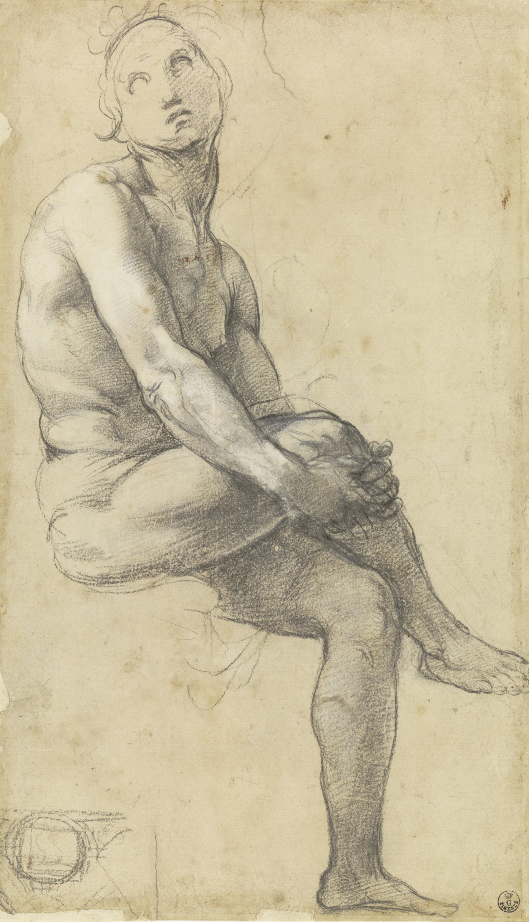
A Raphael drawing illustrating the concept (see above), Uffizi


_______________________________________________________________
_______________________________________________________________


II Excerpts from treatises


1) de Piles "Les premiers élémens de la peinture pratique" has many pages on drawing technique. See my translation of them HERE

 2) Jombert:  see my translation of some parts of his drawing treatise HERE

3) de Lairesse (my translation from this French translation of his 1701 drawing treatise):

"Lesson 7:
After you finish the contours you place the shadows, which requires getting used to drawing with sanguine to hatch neatly and distinctly without stomping or "grainer" like some masters teach.  ( Grainer / grener/  rauselen / röselen / тушевать is to rub the chalk on the grain of the paper in a way to get a textured tone without visible hatch marks, L.R.)

Lesson 8:
Hatch-marks should cross no more than two or three times (in the strongest shadows) as seen in figures 10-16.  For relief only one layer of hatch marks should be used, and for deepest hollows you can blend with a stomp or with the crayon (estomper ou grainer).   Contours should be lighter on the light side and more pronounced on shadow side.  Shading is done from top to bottom with simple, but rather strong hatching with as equal a distance (between lines) as possible.  Afterwards hatch the lighter half-shadows with simple, more or less light lines according to the object because half-shadows should never be cross-hatched.  To finish and give all the force to the shadows you need to double the hatch marks and even triple them if needed.

<...> for hatching with sanguine (red chalk), it's likely that students will find it more difficult to do than "grainer" (shading with smooth tone), but it will make them develop a firmer hand to make sure that all the hatch marks are of the same thickness and are equidistant <..> it demands more judgement and exactness, then one needs to know what effect is produced by two or three or four lines that cross each other, which can't be learned by simply stomping or "grener" (rubbing the chalk on paper, L.R.). (de Lairesse, 33)

 p 34  look at the hatch-marks that pass on the front of the head D and then E.  The latter turn to form an ark, the former turn downwards.   One sees this difference better when one looks at a shaded column placed above or below the horizon line.  It will suffice for now to know in what circumstances one should vary the hatch-marks, to get your hand used to it, because the beautiful style (la belle-manière) consists of that."

_______________________________________________________________
_______________________________________________________________


III Bibliography
(for more links to digitised versions of drawing treatises see this page)

Armenini, Giovanni Battista. De veri precetti della pittura. Ravenna, 1587

Bates, John. The Mysteryes of Nature and Art. London, 1634. 

Bosse, Abraham (1602-1676). Traicté des manieres de graver en taille douce sur l'airin. Par le Moyen des Eauxs Fortes, & des Vernix Durs & Mols. Ensemble de la façon d'en Imprimer les Planches, & d'en Construire la Presse, & autres choses concernans lesdits Arts. Par A. Bosse, Graveur en Taille Douce. Paris, 1645

Cennini, Cennino. Il libro dell'arte. Late 1300s to ealry 1400s, Italian and English translation

Goeree, Willem Inleydinge tot de Algemeene Teyken-Konst. 1668, 1670 (this German edition scan is readable quality)


Hilliard, Nicholas (1537 (ca.)-1619).  A Treatise Concerning the Arte of Limning, by Nicholas Hilliard, together with, A More Compendious Discourse Concerning ye Art of Liming, by Edward Norgate, with a paralel modernized text.  Ed. R.K.R. Thornton and T.G.S. Cain.  Manchester, 1981.
The original manuscript written c. 1598-1602

Jenner, Thomas (fl.1631-1656 bio). A Book of Drawing, Limning, Washing or Colouring of Maps and Prints: and the Art of Painting, with the Names and Mixtures of Colours used by the Picture-Drawers. Or, The Young-mans Time well Spent.  London, 1652.

Jombert, Charles-Antoine. Methode pour apprendre le dessein. Paris, 1755

Leonardo da Vinci. Trattato della pittura. 1510s, first published 1651  treatiseonpainting.org (or html, liberliber.it pdf)

Lairesse, Gérard de (1640-1711). Grondlegginge ter teekenkonst : zynde een korte en zeekere weg om door middel van de geometrie of meetkunde, de teeken-konst volkomen te leeren.  Amsterdam, 1701  
in Dutch or its later translation to French HERE.

Norgate, Edward (1580/1 - 1650). Miniatura or the Art of Limning. Ed. J. Muller and J. Murrel.  New Haven and London, 1997.
The original manuscripts date c. 1626-8 and c. 1648.

Peacham, Henry (1576?-1643?). The art of drawing with the pen, and limming in water colours, more exactlie then heretofore taught and englarged: with the true manner of Painting upon glasse, the order of making your furnace, Annealing, etc.  London, 1606

De Piles, Roger (1635-1709) Les premiers élémens de la peinture pratique. Paris, 1684.

Ratcliffe, Thomas; Daniel, Thomas (printers); Newman, Dorman; Jones, Richard (booksellers) The excellency of the pen and pencil... London, 1668, 1688

Sanderson, William 1586?-1676.  Graphice, the use of the pen and pensil, or, The most excellent art of painting : in two parts 1658


© Lala Ragimov


Sunday, 24 November 2013

Drawing treatises online

my related posts:

This is a directory of free downloadable 1400s-1700s drawing instruction books I arranged in two groups:
Treatises - textbooks with detailed instructions and information about materials, techniques, and theory of drawing. Many contain illustrations and examples for copying.
Drawing books, anatomies, books of proportion - richly illustrated books without detailed descriptions of technique.
Drawing books usually have no text and teach through images to be copied by the student in the order of growing complexity.  Books of proportion, anatomy, etc. contain text related to those specific topics in addition to numerous images. 

These books are a window into art education of the time, so they are fascinating to study for anyone who wants to understand old master drawings better, and for anyone trying to copy or assimilate this style.
I keep adding to the list, so if you have any corrections or suggestions for more sources, please comment below or send me an email.


de Lairesse, 1701, GRI, pdf here

Treatises:

(Italian, Dutch, Flemish, French, English, German, Spanish, each in chronological order)

Italian Treatises
(Cennini and Armenini providing most information about technique and tools):

* Cennini, Cennino 1370-1440. Il libro dell'arte. Early 1400s
            Italian, 1859 e-book; liberliber pdf; ilpalio.siena.it html
            English, (tr. Thompson 1933), html
* Alberti, Leon Battista 1404-1472. De pictura. 1435
            Latin and Italian, liberliber.it html
            Italian transl.: 1547 e-book; wikisource html
* Leonardo da Vinci 1452-1519. Trattato della pittura. 1510s, first published 1651 (info)
            English, French, Italian, books, manuscripts, images treatiseonpainting.org
            Italian, Wikisource html, liberliber.it pdf
* Vasari, Giorgio 1511-1574.  Le vite de' più eccellenti pittori, scultori e architettori. 1550
            Italian,  vasari.sns.it html
            English translation (of parts of Vite), Vasari on technique. 1907  e-book
* Lomazzo, Giovanni Paolo 1538-1600. Trattato dell'arte de la pittura.
           Italian, e-books: 1584, 1585, 1590
           English (tr. Haydock, 1598): e-book
* Armenini, Giovanni Battista 1530-1609. De veri precetti della pittura.
           Italian, e-book, 1586
* Baldinucci, Filippo 1624-1697 Vocabolario toscano dell'arte del disegno. (an arts dictionary)
           Italian, e-books 1681, 1809


Dutch / Flemish Treatises 
(Goeree and de Lairesse provide the most detailed technical instructions)

*Van Mander, Karel 1548-1606. Het schilder-boeck. 1604
            Dutch, dbnl.org html
*Rubens, Peter Paul 1577-1640 and others (after). Theorie de la figure humaine.
            French, e-book 1773
* Passe, Crispijn van de (d. 1670).  La prima-[quinta] parte della luce del dipingere et disegnare.
            Italian, Dutch, French, German, e-book, 1643

* Goeree, Willem 1635-1711
 Inleydingh tot de practijck der al-gemeene schilder-konst, waer in neffens de heerlijckheyt en nuttigheydt der selve, kortelijck wert aengewesen
            Dutch, e-book, 1670 ( Universiteitsbibliotheek Utrecht)
Anweisung zu der allgemeinen Reiß- und Zeichen-Kunst.  
            German transl., e-books: 1669, 1677(GDZ, with links to ToC headings)
Anweisung zu der Practic oder Handlung der allgemeinen Mahler-Kunst.
            German transl., e-books: 1677 (GDZ), 1678
Anweisung zu der Mahler-Kunst.
            German transl., e-book 1756, 1750 (high res.)
Natuurlyk en schilderkonstig ontwerp der menschkunde leerende niet alleen de kennis van de gestalte . tot de teykenkunde, schilderkunde . toepassen, maar ook hoe sich een...
            Dutch, e-book, 1683
Inleyding tot de praktyk der algemeene schilderkonst.
            Dutch, e-books: 1704, 1705
An Introduction to the General Art of Drawing
            English, html 1674 (my transcript) NEW

* de Lairesse, Gerard 1640-1711.  Grondlegginge ter teekenkonst : zynde een korte en zeekere weg om door middel van de geometrie of meetkunde, de teeken-konst volkomen te leeren. 
           Dutch, e-book 1701
           French translation, 1787, e-book
           English translation, 1764, e-book NEW    


French Treatises

* du Fresnoy, Charles Alphonse 1611-1668. De arte graphica. 
          French tr. by de Piles 1668
          English tr. by Dryden 1695, tr. by William Mason 1783
* Bosse, Abraham 1602-1676. Traicté des manieres de graver en taille douce sur l'airin. Par le Moyen des Eauxs Fortes, & des Vernix Durs & Mols. Ensemble de la façon d'en Imprimer les Planches, & d'en Construire la Presse, & autres choses concernans lesdits Arts. Par A. Bosse, Graveur en Taille Douce. Paris, 1645
(This is a printmaking treatise, but Jombert advised it to drawing students wanting detailed advice on hatching)
          French, e-book, 1645
* de Piles, Roger 1635-1709. Les premiers élémens de la peinture pratique.
          French, e-book 1684
          English, my own translation of pp 9-33
          French, e-book, expanded posthumous edition 1766
* Jombert, Charles-Antoine 1712-1784.
Nouvelle Methode pour apprendre a dessiner sans maitre. 
          French, e-book, 1740
Methode pour apprendre le dessein.
          French, e-book, 1755
          English, my translation of some excerpts


English Treatises

* Peacham, Henry 1578-1644?. The gentlemans exercise, or, An exquisite practise : as well for drawing all manner of...
         English, Getty e-book, 1634 NEW
* Bate, John. The Mysteryes of Nature and Art.
         English, links to pdf and jpg versions at the end of the page about this 1634 book
* Jenner, Thomas (active 1631-1656). A Book of Drawing, Limning, Washing or Colouring of Maps and Prints: and the Art of Painting, with the Names and Mixtures of Colours used by the Picture-Drawers. Or, The Young-mans Time well Spent.
         English, info and pdf of this 1652 book
* Sanderson, William 1586?-1676.  Graphice, the use of the pen and pensil, or, The most excellent art of painting : in two parts
         English, e-book, 1658
* Ratcliffe, Thomas, Daniel, Thomas (printers) Newman, Dorman, Jones, Richard (booksellers) The excellency of the pen and pencil...
         English, e-books: 1668, 1688
* Browne,  Alexander 1660-1677. (translations and borrowings from other authors) Ars pictoria: or, An academy treating of drawing, painting, limning and etching...
         English, e-book, 1669
* Salmon, William 1644-1713. Polygraphice, or, The arts of drawing, engraving, etching, limning, painting, vernishing, japaning, gilding, &c 
          English, e-books: 1685, 1701


German Treatises

* Fürst, Paul  Theoria Artis Pictoriae. A text with a compilation of prints from Italian drawing books
           German, with an informative introduction (2009), 1656, pdf (Heidelberg University)
* Preissler, Johann Daniel.  Die durch Theorie erfundene Practic, oder Gründlich-verfasste Reguln, derer man sich als einer Anleitung zu berühmter Künstlere Zeichen-Wercken bestens bedienen kan..
           German, four Volumes 1761-1663 e-books (Heidelberg University)
* Herzberg, Friedrich.  Anleitung zum gründlichen Unterricht in der Handzeichungskunst für Anfänger.
           German, e-book 1780 (Getty) NEW

Spanish Treatises

* Pacheco, Francisco. Arte de la pintura.
           Spanish, e-book, 1649


Jombert, 1740

* * *

Drawing books, Anatomies, Proportion books, etc.:


* For anatomy books see THIS great resource (Historical Anatomies)
   also see Tortebat, François. Traité d'anatomie appliquée aux beaux-arts. 1667-8 ("full view")

* rer, Albrecht 1471-1528.   
Vier Bücher von menschlicher Proportion. 1528 jpgs
Della simmetria dei corpi humani, Libri Quattro. e-book 1594 

* Palma il Giovane, Jacopo 1544-1628.
Regole per imparar a disegnare i corpi humani diuise in doi libri delineati dal famoso pittor Giacomo Palma, lombardiabeniculturali.it, jpgs
Principi del disegno/ Principles of drawing Harvardartmuseums.org , jpgs

* Fialetti, Odoardo 1573-1638.  
Tutte le parti del corpo hvmano diuiso in piu pezzi. e-book 1608
Il vero modo et ordine per dissegnar tutte le parti et membra del corpo humano. e-book 1608

* Cousin, Jehan le Jeune 1522-1593.   
Livre de pourtraiture jpgs 1608,
La vraye science de la pourtraicture, e-book 1671

* after Carracci (prints by Luca Ciamberlano, etc) Scvola perfetta per imparare a disegnare tutto il corpo humano / cauata dallo studio, e disegni de Caracci.  (1600-1630)
Getty Research Institute e-book  NEW
British Museum - individual jpgs

* after Guercino (prints by Olivero Gatti c 1620, Francesco Curti 1635-40) drawing book pages (parts of the face, body parts, figures, heads), British Museum - jpgs

* de Ribera, Jusepe. 1622 etchings, Harvard jpgs

* Bracelli, G. B. 1624, not a real drawing book, but does demonstrate figure construction basics in a fun way, so I imagine it could have been used by students, here

* after Rubens 1577-1640.
Drawing book sheets from 1630. British Museum, jpgs;
de Ganay manuscript jpgs 1600s (after 1640) - write "de Ganay" in image search

* della Bella, Stefano.   
I principii del disegno. 1640s. British Museum jpgs , 1824 ed. (see description), GRI, e-book  NEW
Recueil de diverses pieces Servant à l'Art de portraiture. 1645-50. British Museum jpgs 
Diverses testes et figures. 1650 British Museum jpgs
Livre pour apprendre a dessiner. 1647-52. British Museum jpgs

* Bloemaert, Abraham (after), Frederik. Het Tekenboek. 1650-56,
Getty Research Institute e-book NEW; British Museum jpgs

* Fuller, Isaak.  Un libro da designiare. Publisher Peter Stent 1654 British Museum jpgs

* Pesne, Jean, 1623-1700; Audran; PoussinLivre pour aprendre à désigner avec les proportions des parties qui ont esté choisie dans les ouvrages de N. Poussin. 1680 pdf

* Jabach, Everhard  1618-1695. Recueil de 283. estampes gravées à l'eau forte par les plus habiles peintres du tems, d'apres les desseins des grands maitres, que possedoit autrefois M. Jabach et qui depuis on passé au cabinet du roy.  e-book

* Testelin, Henri, 1616-1695 Sentimens des plus habiles peintres du tems, sur la pratique de la peinture et sculpture : recueillis & mis en tables de preceptes, avec six discours academiques, extraits des conferences tenuës en l'Academie Royale desdits arts ... par Henry Testelin, peintre du roi, professeur & secretaire en ladite Academie.  e-book, 1680

* Audran, Girard 1640-1703.  Les proportions du corps humain : mesurées sur les plus belles figures de l'antiquité 1683

* Le Clerc, Sébastien 1637-1714.  Pricipes de dessein / Divers habillemens des anciens grecs et romains  1700

* van Somer, Paul.  Figurae variae. 1675-1714 drawing book prints jpgs British Museum

* Le Brun, Charles 1619-1690.
Méthode pour apprendre à dessiner les passions: proposée dans une conférence sur l'expression générale et particulière. e-book 1702
(after le Brun) Caracteres des passions, sur le desseins de C. le Brun e-book 1750

* Huet, Jean-Baptiste 1745–1811. Premier[-dix-huitiéme] cahier de fragmens et de principes de desseins de tous les genres... Getty e-book 1778  NEW


Stefano della Bella, Recueil de diverses pieces Servant à l'art de portraitureBritish Museum

 ***

compiled by Lala Ragimov